Line Art: Meet the Artists Behind Burton’s 2024 Board Graphics
How does that old adage go? Never judge a book by its cover? Well, guess what–we’ve read some really quality stuff with eye-catching covers over the years. And no, despite what you’re thinking, we’re not just talking about snowboard magazines. Now, you might be asking, “Where the heck are you going with all of this?” Listen—we know older siblings, waistwidth obsessed friends, and even the employees at your local shop might stress to “never buy a board because of its graphics,” so why not just alleviate that concern altogether?
Here at Burton, we’ve invested significant time and resources in collaborating with the best artists in the snowboard community to craft the most captivating board graphics on planet Earth. Know what else? We’ve also invested significant time and resources in building the very best boards on planet Earth. Which means you never have to sacrifice performance for style. Period.
For this season, we set out to raise the bar in developing our favorite graphics yet. To get this done, we teamed up with a batch of artists, visionaries, and friends—some already part of the Burton Family—who share our vision for creating performance-driven boards that look just as good beneath our feet as they do hanging on our walls.
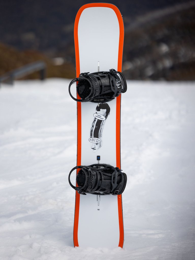
Good Company by Richard Vergez
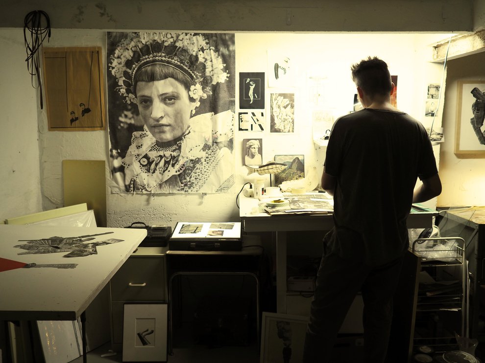
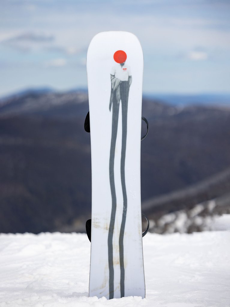
When you see Richard’s art, you’re instantly encouraged to be a little different, embrace a little more weirdness, and step outside the norm. A Cuban-American visual artist, Vergez creates hand-made head-turning collages with paper and mixed media. It’s a fitting graphic style for the Good Company deck—a freestyle rig designed for turning heads in the park, streets, and literally anywhere else you take it.
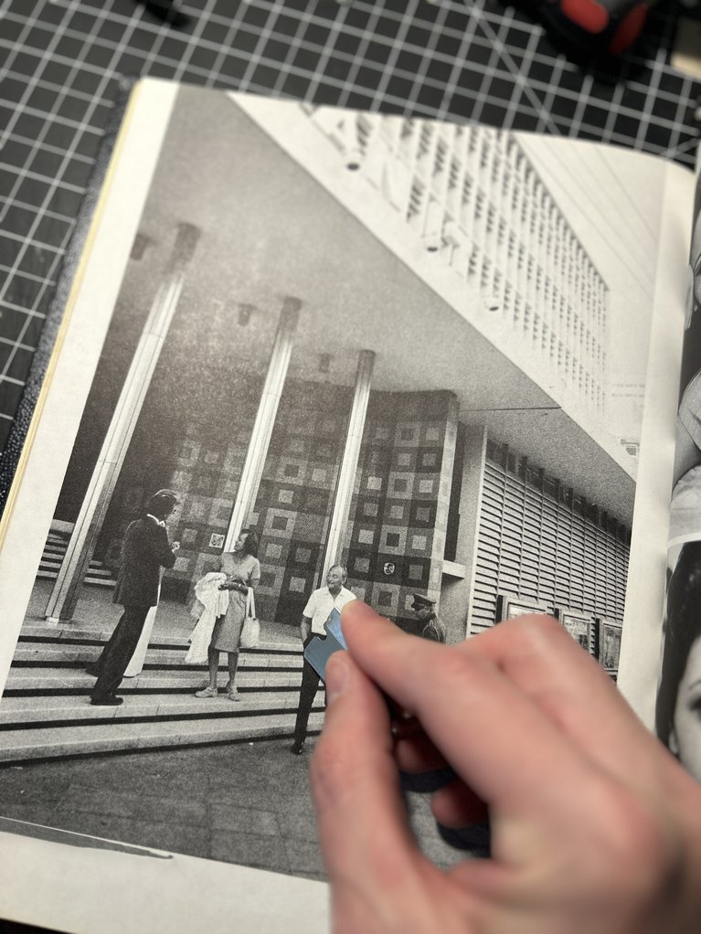
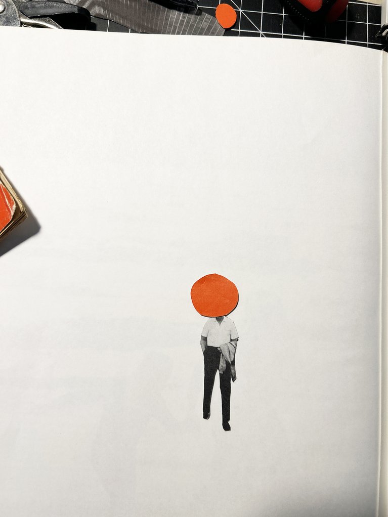
The idea here is extending your body into an expansive realm. Riders do it with a snowboard; I do it with my art. I use a mixture of analog and digital and cut out the collage piece first to isolate it. Then, I place it on my digital scanner bed and move the pieces around with my hands until I get the desired effect. In this case, the figure’s legs and the guy’s face elongated. This graphic would pair well with a rider with a good sense of humor and an appreciation for the absurd.
Blossom by Niels Schack
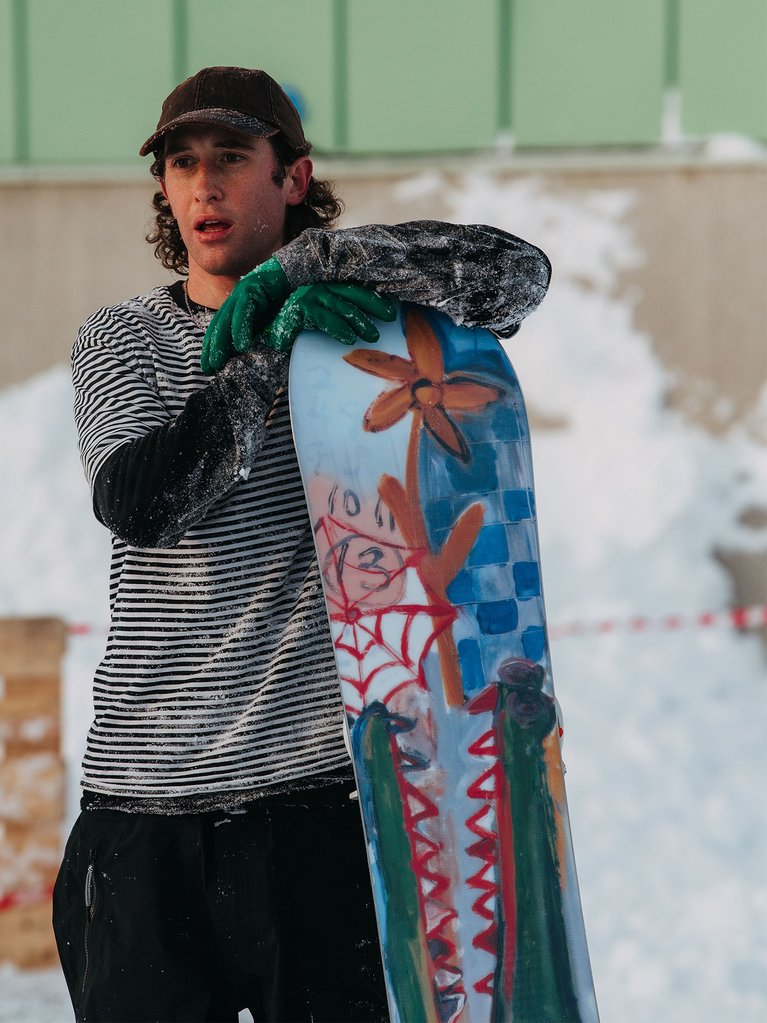
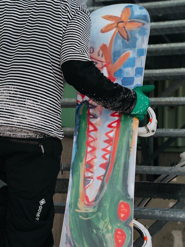
Burton Team rider Niels Schack set out to blend the pristine and the chaotic with this season's Blossom art. While the clean top sheet elicits a calm and subtle beauty, the base lets total chaos reign. And what better way to tie this contrast together than with the ferocious yet elegant crocodile? Much like the board itself, the Blossom’s graphic offers an unlikely balance of peace and mayhem:
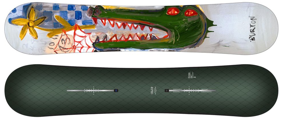
This was the start of a narrative that brings geological and biological history to the Blossom. Something that would mix pristine life and chaos. Nothing really like the crocodile for the most elegant while savage creature to represent that feeling.
Deep & Free Thinker by Scott Lenhardt
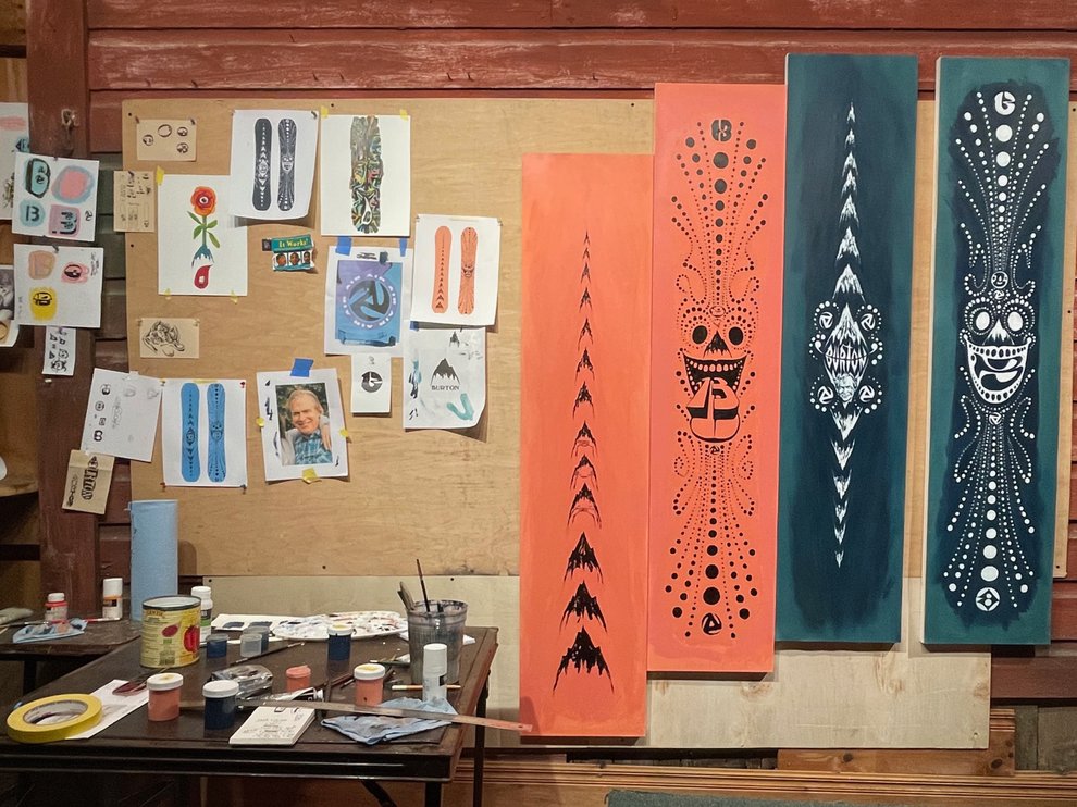
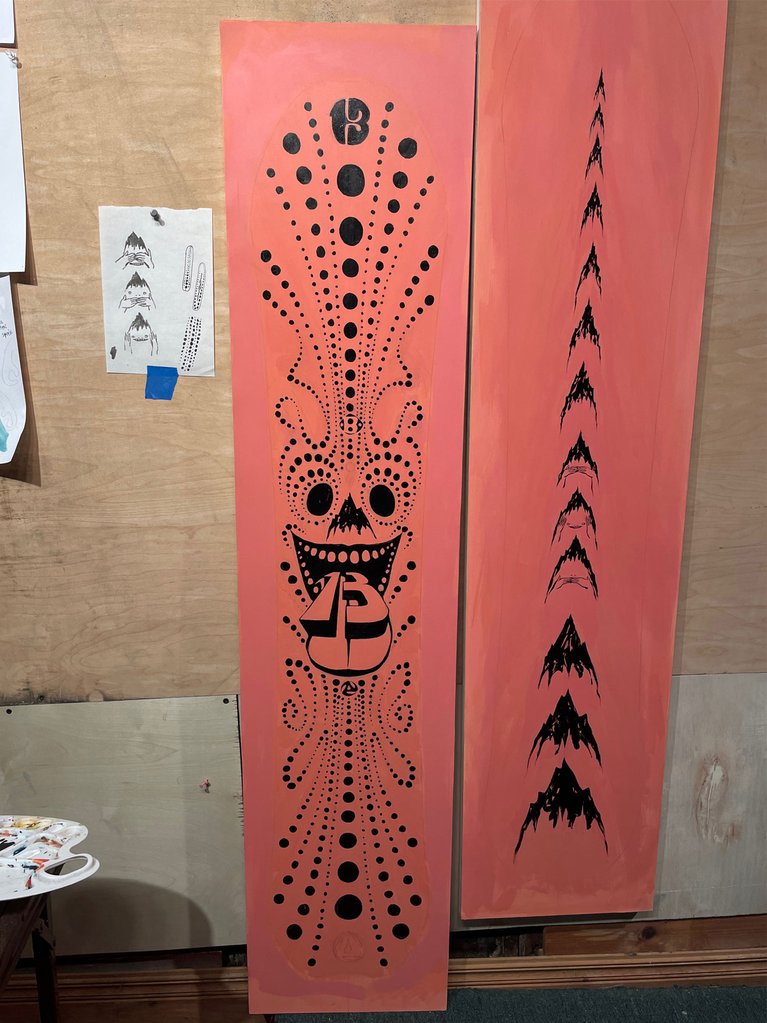
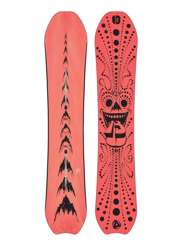
The long-running collaboration between artist Scott Lenhardt and Burton Team rider Danny Davis continues to bring the Thinker boards to life. This season's graphics invoke a wacky, carnival-inspired vibe with an unhinged and hand-painted feel. Different-sized dots channel snowboarding’s limitless energy, and hidden gems—like a portrait of Jake—honor the deep Burton legacy.
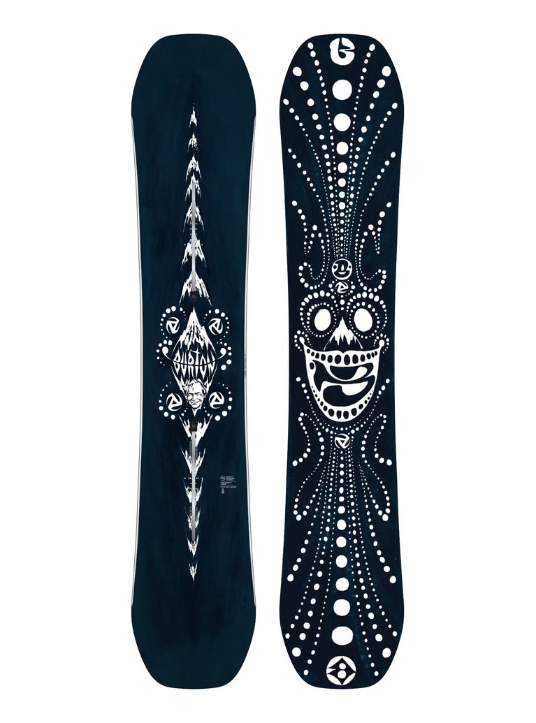
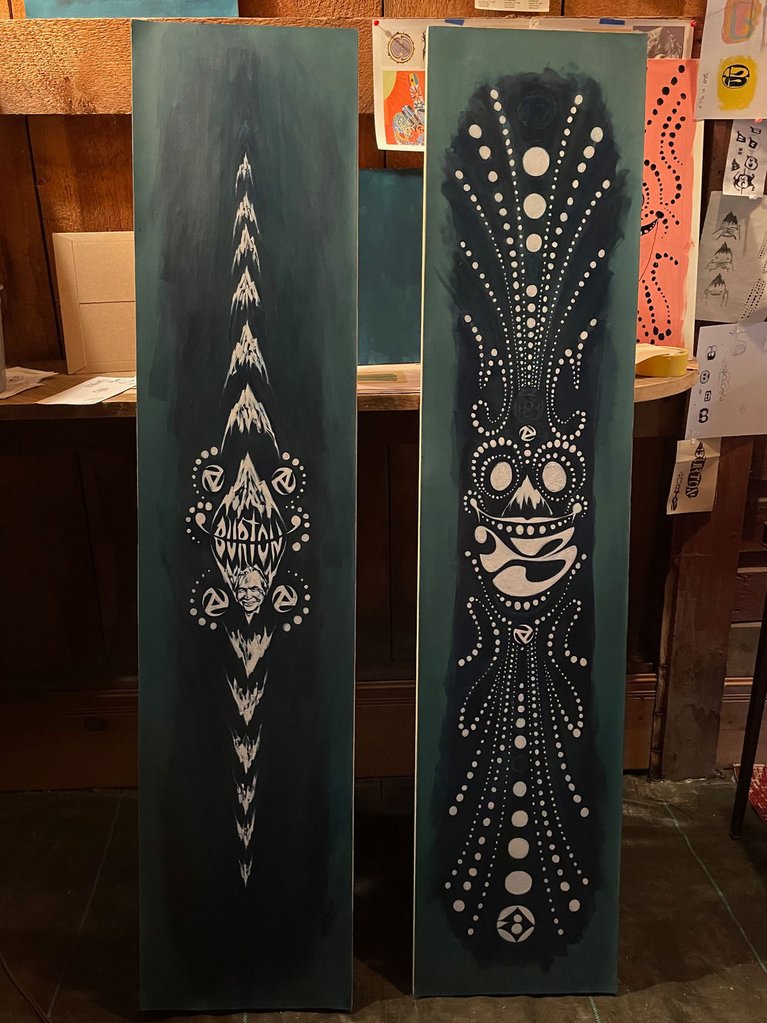
Danny’s art direction behind this year’s Thinkers was to make them look instantaneous and handmade like I came over to his house one night and painted directly on his boards. I didn’t create them in a night but the attitude behind my brush strokes was as if I was hanging out at my friend Danny’s house, taking breaks to pick up my guitar and eat a delicious selection of charcuterie.
As the preferred vehicle for expressing ourselves as riders and humans, we think it’s vital to avoid any degree of compromise. That goes for both performance and style. Besides, if you’re going to spend the next few months staring at that deck strapped to your feet, shouldn’t it be something you’re hyped on? We sure as hell think so.
That’s why—like every other season—we invested endless time and energy into this critical piece of the creative process. From hitting the drawing board with our #BurtonTeam riders to connecting with some of our favorite artists, we found every hour—and every ounce of sweat—to be completely worth it.
So, while some might insist on preaching the ol’ “don’t judge a book by its cover,” we simply say there’s no need for judgment, period.