Line Art: Meet the Artists Behind Burton’s 2025 Snowboard Graphics
by
We’re right there with you —
while performance is paramount in selecting any snowboard, graphics are pretty darn important to us, too. Which is why we take pride in never skimping in the art department. This season, we summoned the help of a few familiar friends in addition to a few new faces to curate our best collection of graphics yet. Without further ado, let’s meet the artists behind Burton’s 2025 board graphics.
Burton Blossom by Niels Schack & Morgan Katomba
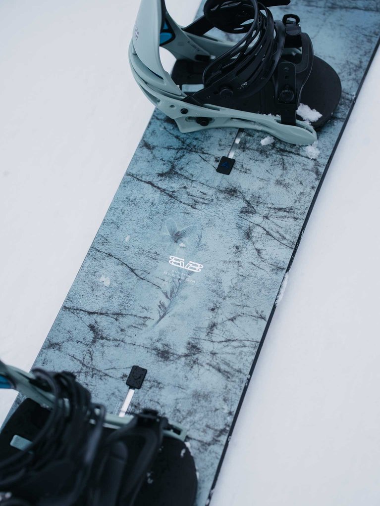
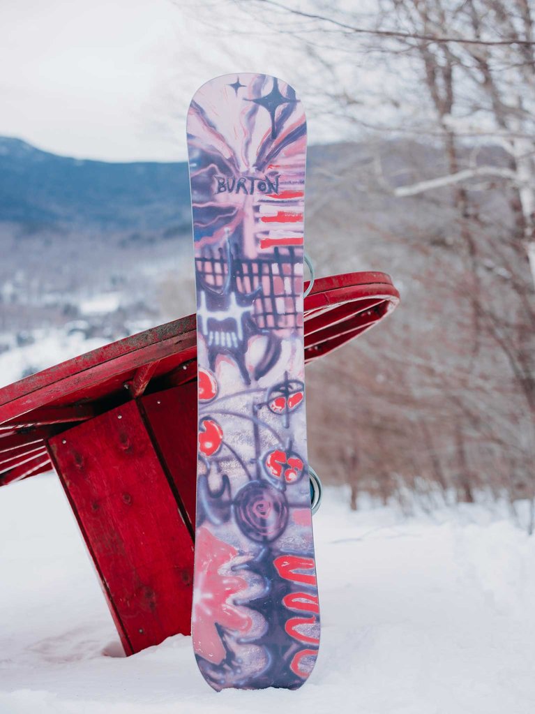
We researched how things break down. We studied distress, wear, and transition, that led us to our main theme “erosion” - We had fun looking at geological process and how materials get worn away and transported by wind and water. This for me represented how things grow, transform, and move in our world. Rocks precede all natural habitats and having that as the base of our design felt like it continues the story telling of the Blossom board. The top sheet is therefore like a rock and changes over time depending on the environment you place it in. Whether it’s hot, cold, humid, or dry, it will react differently, like the world does. The base represents the chaos needed for things to change and erode and mimics the inside of a broken rock. The graffiti and abstract painting, parisian artist Morgan Katomba and myself created this effect in collaboration.
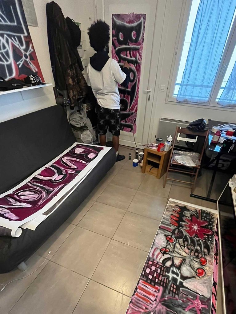
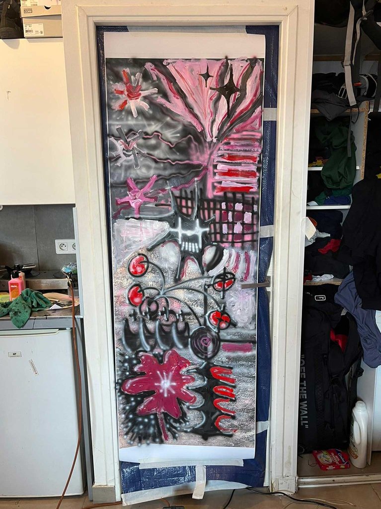
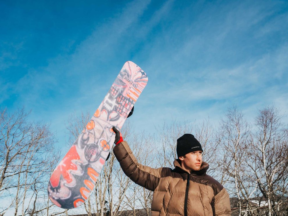
Free to be, free to create — that’s been the Blossom’s modus operandi since its inception. So, for 2025, we once again summoned the creative, free-flowing mind of team rider Niels Shack for its signature graphics. Inspired by the look of eroded rock with a crystal embedded inside, this season’s Burton Blossom is much more than what meets the eye. Opposite of its vibrant, colorful base design is a topsheet that actually shifts colors when the temperatures drop. It’s a chameleon of sorts, easily shifting from the resort to the streets.
Burton Cartographer by Julio Desmont
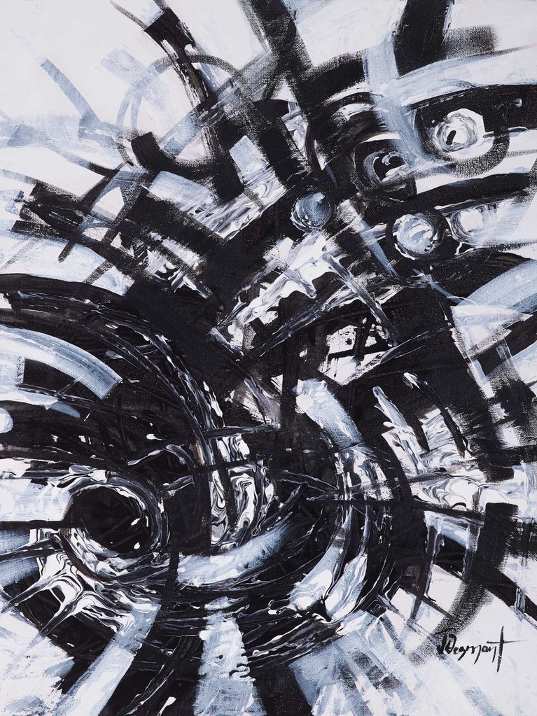
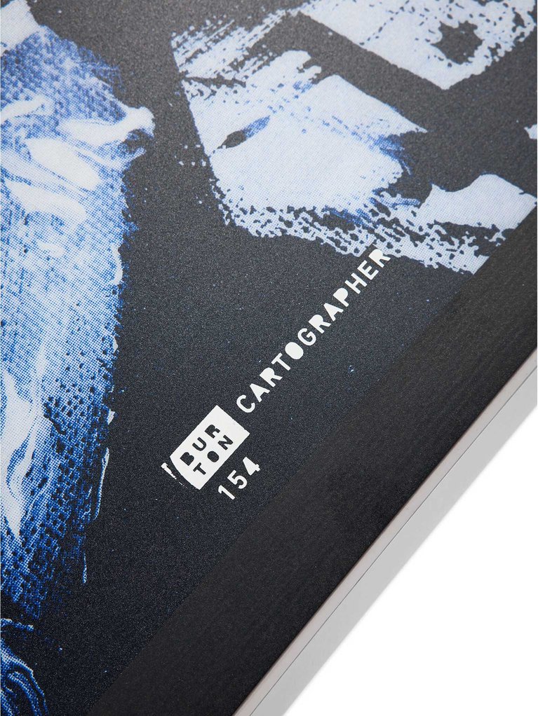
The Burton Cartographer was designed specifically for those looking to carve their own path through the mountains. It only made sense that we graced it with a graphic to match. Drawing inspiration from Picasso to O’Keefe, Vermont-based artist Julio Desmont blended deep lines with the abstract to beautifully capture the spirit of the Cartographer: a board that has no shortage of personality, with the ability to adapt to a variety of terrain.
This painting was my first try in a collection of black and white testing vibrancy, one of the fundamentals of my style. It has been a fascinating challenge while departing from what I am used to. As I dropped the black paint on the canvas, I realized there was no turning back. That moment on the canvas translated into a broader life lesson for me, allowing me to create space for more enjoyable and fulfilling experiences.
Burton Custom X by Bruno Penabranca
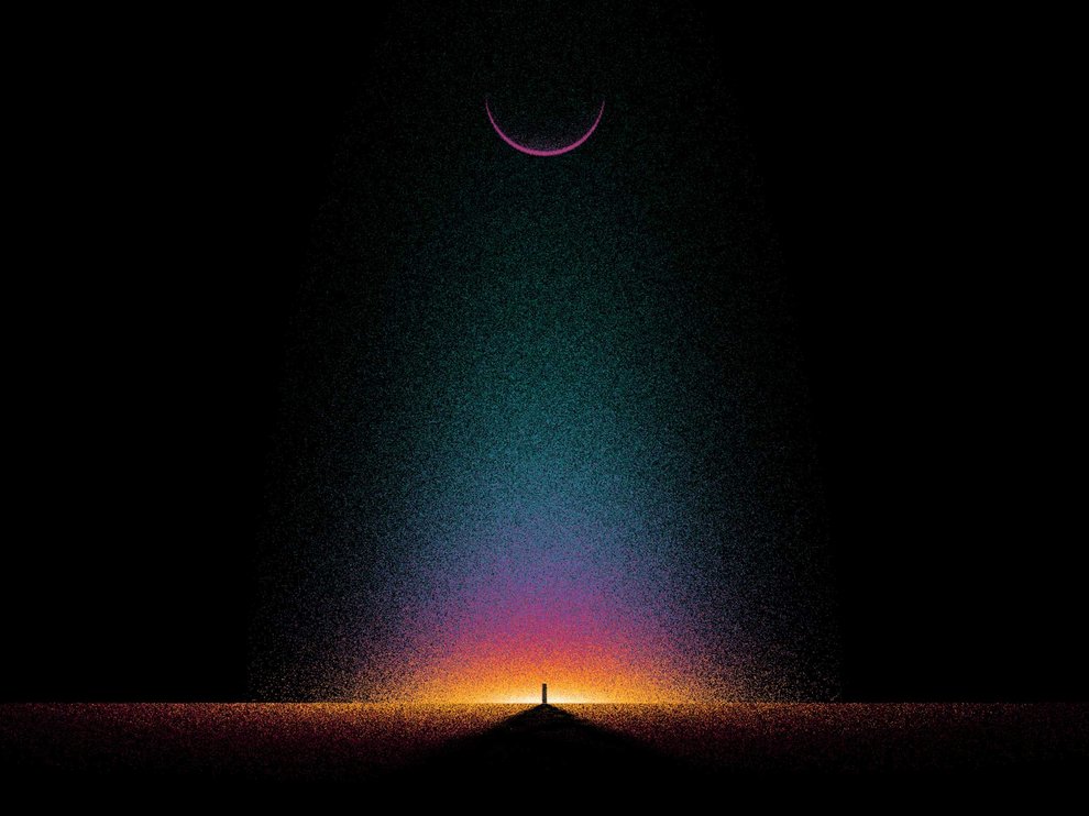
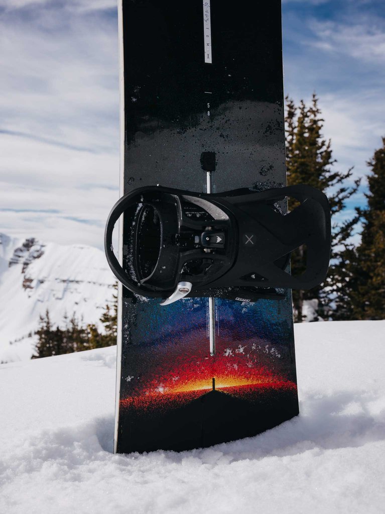
One of the most powerful and timeless boards in our line, it was vital for the Burton Custom X to have a graphic to complement. Enter Bruno Penabranca. A visual artist born and raised in Brazil, and now based in NYC, his work is a journey of beauty, balance, and minimalist psychedelia. Much like the constant cosmic journey of snowboarding, his 2025 Custom X graphics capture this timeless board’s powerful and ever-seeking personality.
Burton Family Tree by Ryan Crotty
Seeing as this is our most versatile Burton Family Tree line to date, we enlisted the abstract work of artist Ryan Crotty to revamp the graphics for 2025. Featuring black-and-white mountainscape-inspired graphics on the topsheet, with complementing saturated colors on the base, this season’s Family Tree collection literally glows with meditative calm beneath your feet — while capturing the all mountain purity that these boards have long been synonymous with.
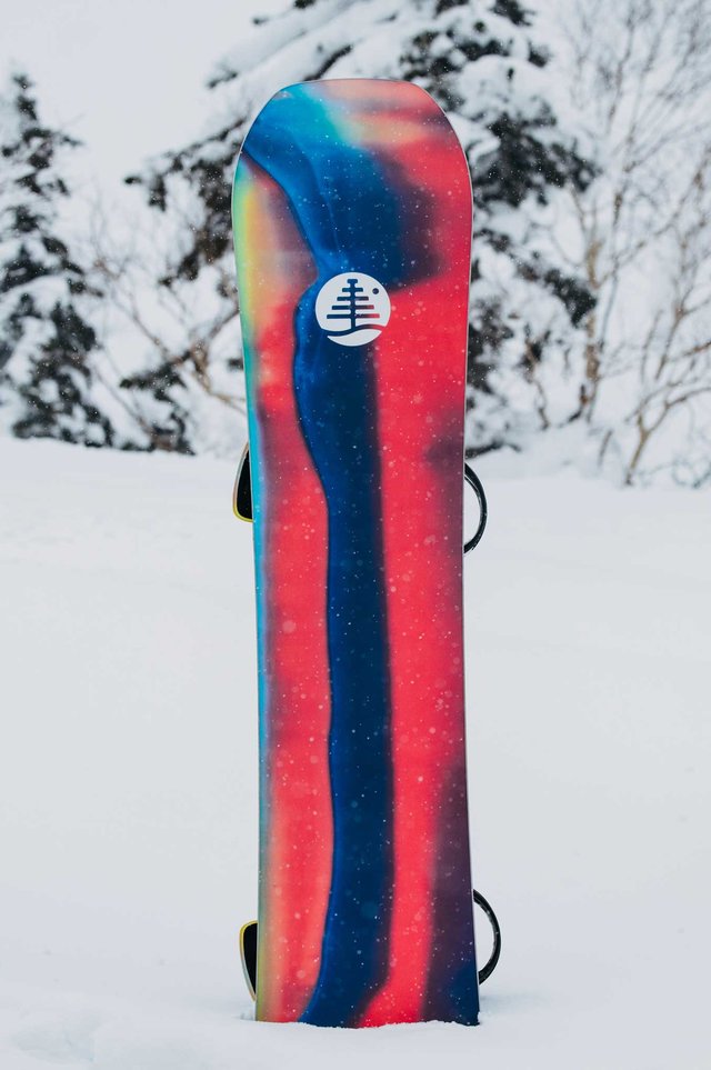
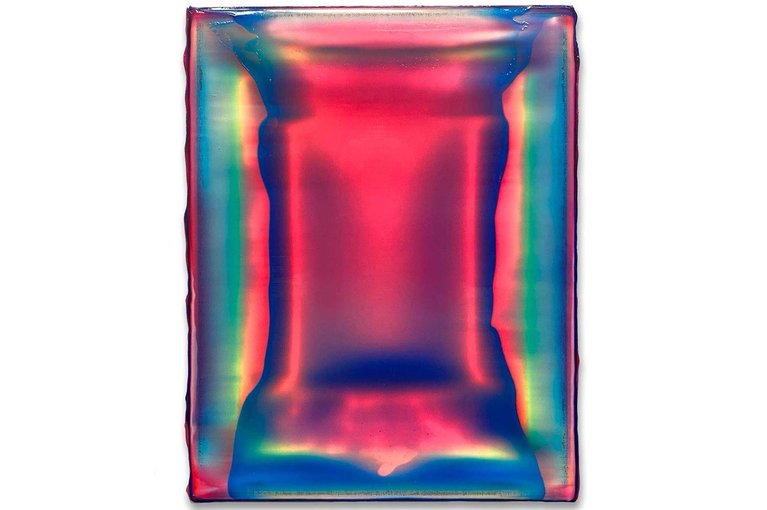
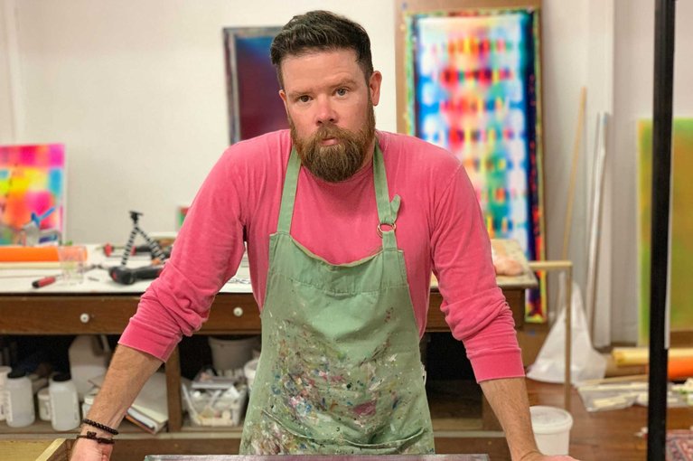
I can’t say I had previously imagined taking a painting off the gallery wall and riding it down the mountain, but that’s essentially happening with Burton’s help. It’s a bit of a unique spin on board graphics. Fine art on some fine equipment, form meets function. I’ll ride it and then hang it on the wall.
Burton Story Board by Jesse Dawson, Ashley Rosemeyer & Casey Callahan
A true collaboration from some of the most talented women we know, this year’s Burton Story Board inspires freeride freedom in both its artwork and performance. Combining the artistic expression of photographers Jesse Dawson and Ashley Rosemeyer, as well as Burton’s in-house designer, Casey Callahan, the Story Board is both beautiful and badass — much like the aforementioned women. It’s a blend of disruption and discipline, an aesthetic representation of the board’s confidence-inspiring, full-throttled nature.
I took photos from Japan, Canada and even Vermont to make up this board. The work on this board got really exciting when Ashley Rosemeyer added her incredible photo of Maria as the main image. Burton’s own Mercedes Ortega, also from Park Affair, makes a smirky appearance on the board as well. What I love about this board is the attitude, the “no fucks given” feeling. This board is a portrayal of strong woman who rip. A board made for women, by women.
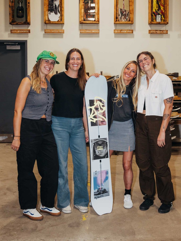
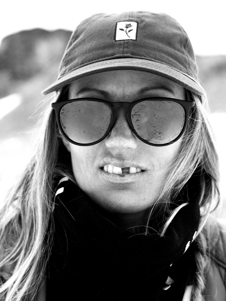
The creative vision behind this design was to allow the personality of the board to shine. So many strong, badass women ride this board in every terrain, every style and we wanted to show off the many sides to women in snowboarding.
Burton Deep Thinker & Free Thinker by Jack Moore
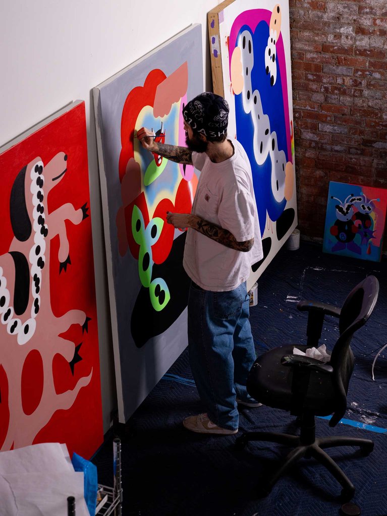
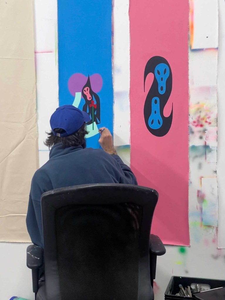
Like the majority of us, graphics have always been a key component to Danny’s boards, too. This season, he summoned the help of artist Jack Moore — aka Yung Bachelor— to expand upon the funky and iconic style of both the Burton Deep Thinker and Burton Free Thinker. Surreal yet playful; bright yet dark; this year’s graphics invoke the contrasting yet complementary personalities of Danny’s two decks. Think deeply, think freely.
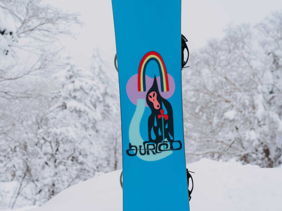
These graphics pay homage to the skate and snow graphics that were burned into my mind as a child. I wanted to recreate the sensations I hold adjacent to my earliest trips to the shop. I was so drawn to the bright, playful and bold character driven graphics that lined the walls. Little did I know, this was my first exposure to art. The shop to me, at that age, was a gallery. I could stay in there for hours walking around. However, unlike the gallery, I was able to touch and feel everything. Given that the spacial area was bigger, the snowboards especially stood out to me. I remember being so in awe of what I saw with the Uninc boards. These graphics draw on my earlier works with a focus on simplicity and heavy color contrast. I wanted to paint something that was powerful and could be seen from afar.
Burton Yeasayer by Eric Thompson
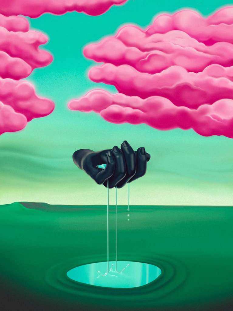
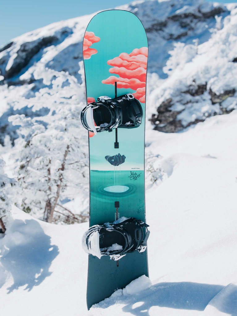
Dream-like would be a good way to describe our popular Burton Yeasayer deck. It’s also a worthy descriptor for the surrealist work of Kansas City-based artist Eric Thompson. Featuring his vibrant, other-wordly design approach, Thompson’s distinct graphics proved to be the perfect complement to our energetic, and always-up-for-anything Yeasayer. Gorgeous from top to bottom; inside and out, it’s a board that’s as appealing to look at as it is to ride.
From the abstract to the logical, monotone to vibrant and a bit of everything in between, this season’s Burton graphics are much like our collection of boards themselves: there’s something for everybody. Featuring the work of our favorite riders, photographers, artists and co-workers, we’re thinking 2025 might be the best-looking line yet.