Digging Through the Archives: Burton Apparel
While trends ebb and flow, decisions made by individual designers have a direct impact on the future, and it’s always fun to look at who influenced what.
At Burton, this is where the Burton Archives come in handy, because it contains volumes and volumes of artifacts from throughout snowboarding's history. From each product ever made to the ideas that never made it, the archives are a perpetual source of inspiration and lessons to be learned.
With a new collection hitting the shelves, we took the opportunity to look at how it got there by pulling in Burton Archivist, Todd “TK” Kohlman, Senior Graphic and Print Designer, Shawn Dumont and Apparel Designer, Maris Turner to look back at nearly 40 years of Burton apparel design. Pay close attention, because many of the designs featured here are also hidden in our new line of Durable Goods.
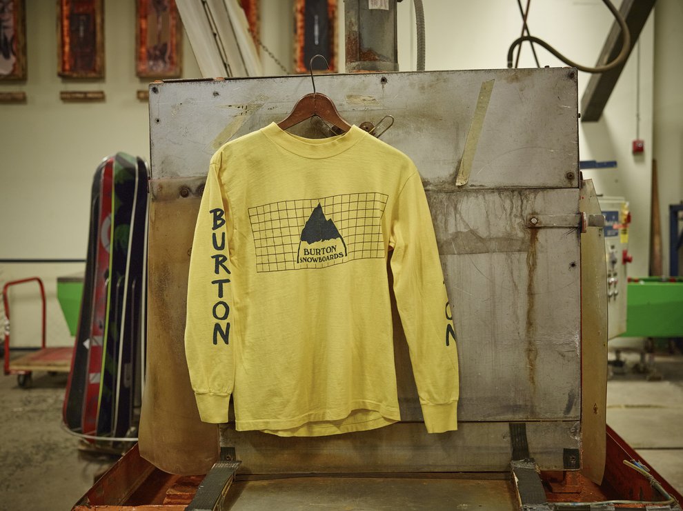
1983/1984 Squared L/S T-Shirt
Dumont: A lot of the prints at this time were board graphics brought over to apparel. They just re-locked everything and repurposed it. Sick logo. This is the original. But where does the grid come in? Why did they use this font on the sleeves? And why is that a Burton look? The way that Neighborhood came in for our collab and re-used this design is amazing. The way they appropriated the Burton graphic language and made something new with it is so sick.
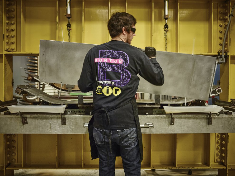
1989 Mystery Air L/S T
TK: This is the first year of the bar logo (pink with white letters in the photo, above). The cover of the catalog featured it.
Dumont: This was done by David Carson. He’s a pretty influential designer, started a magazine called Ray Gun, and was also the art director for Transworld Snowboarding. He kind of changed the direction of skate and snow from looking very much like skiing to having it’s own identity, pulling from punk rock and doing stuff that you just should never do with type. Everyone who knew graphic design was like, “Oh, that guy doesn’t know what he’s doing”, but all the young guys were like, “That’s cool!”
That graphic’s sick. That’s like streetwear now. You could wear that anywhere. And you can see that someone hid their signature in the "B" there. There’s an “F U” right here. If he took the time to put that in, then you could probably find all kinds of hidden stuff in here.
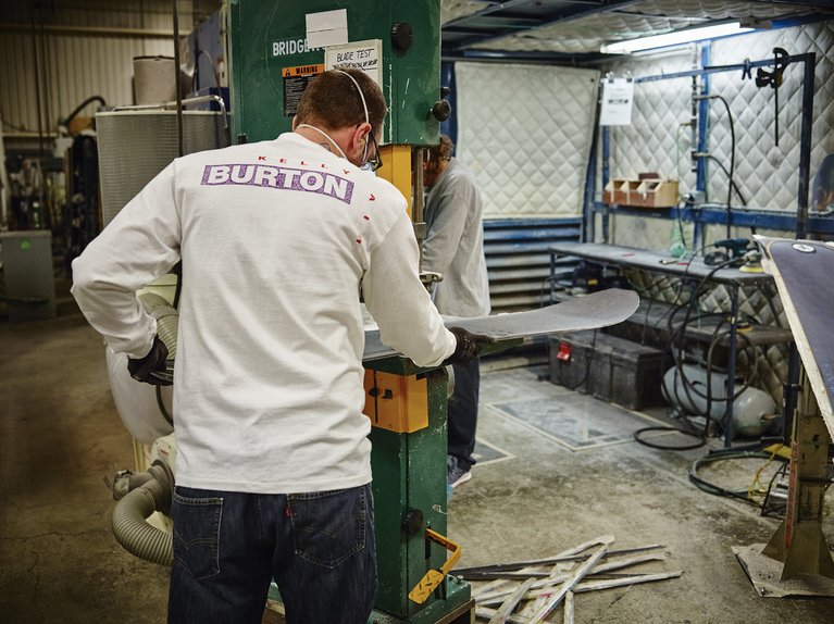
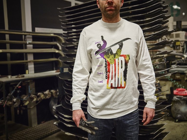
1990 CK L/S T
Maris: This is such anti-design. That’s so weird at the time, for traditional design, and even now. He compressed it down and made it flatter. And this is a weird version of Helvetica that’s wider than it should be and squished. It’s all weird shit that you’re not supposed to do with fonts, like in school you never mess with the fonts, never distort it. And this just breaks every rule.
Dumont: That’s Carson. He was in the right place at the right time, in an industry that was sort of on the vanguard of graphic design, doing things that people had never seen before. So you’ve got all these old graphic designers who were like, “No, you can’t do that.” But he said, “Fuck it, I can do whatever I want.”
They were creating a new design aesthetic from scratch. They were saying, “This is what snowboarding is. This is what skateboarding is. This is what music is.” Because back then it was all really tight. You skateboarded, you listened to Dinosaur Jr…. It was all part of the same culture.
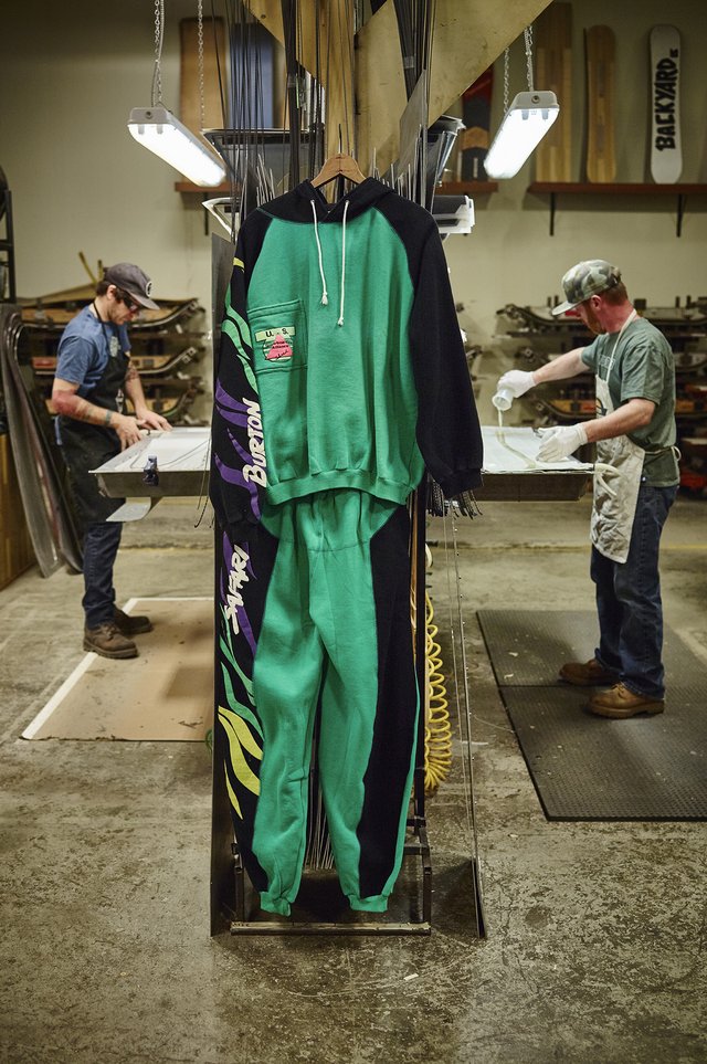
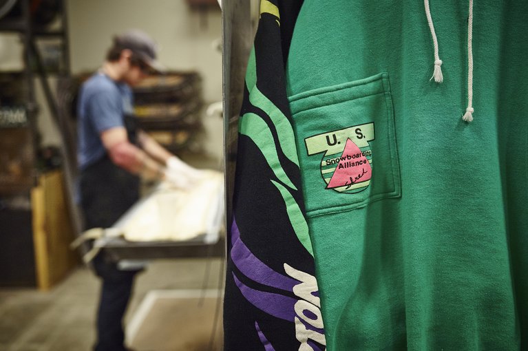
1990 Safari Sweat suit
Dumont: This print is done with this stuff called puff paint. They were just using a shitload of puff paint. It’s coming back, too. People are using it on tees. And does that say ‘shred’? Was that something we said to refer to snowboarding? Like getting ‘gnarly’? I love that. It’s so naïve looking. It’s not good, but it’s not bad. It’s awesome.
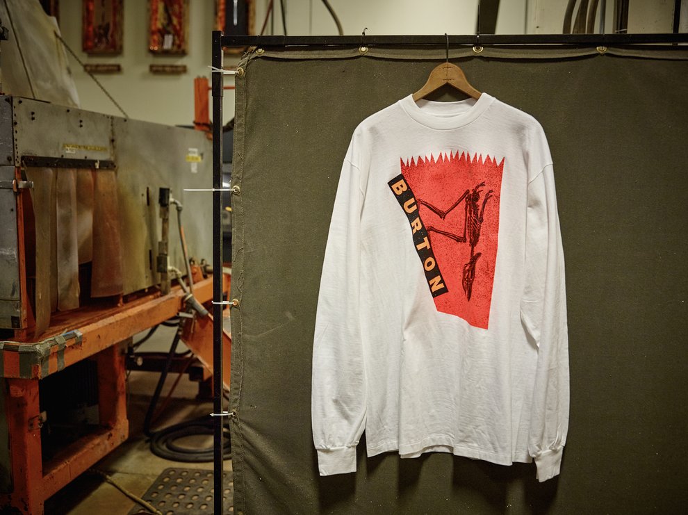
1991 Carnivore L/S T-Shirt
1990’s Burton designer, Michael Jager: This design was conceived of when Alpine snowboarding was still alive and well, though the downhill bomber stance also reflected freestyle, droppin' in on a big hit. I worked on it with one of my partners at the time, George Mench. The idea was the primal attack of the “humanasaurus” attitudinally attacking the terrain fearlessly. We joked a lot then about the fact that we were 'eating the young of ski culture,’ as every parent hated snowboarding and every kid wanted to be in it.
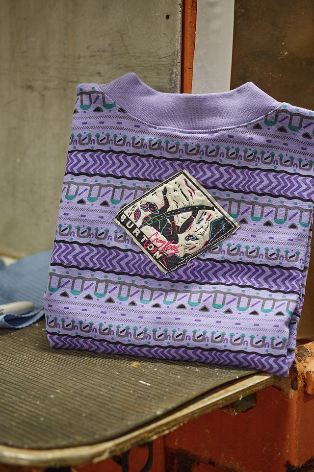
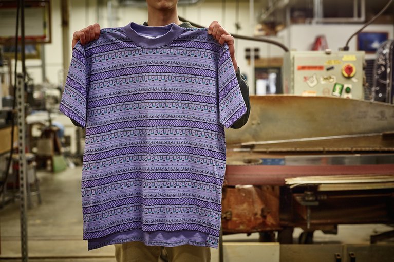
1991 Kelly Mock
TK: Craig Kelly’s signature shirt. After a great 1990 season, killing it in filming and competition, Craig earned his own tee.
Dumont: This is like a timepiece. Big fat neck collar. Drop tail – that’s becoming cool again. Flip it over, and I’d love to re-make this tag, smaller, wedged in somewhere. It’s so big on this, which is crazy.
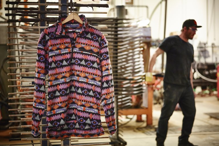
1992 Fleece Pullover
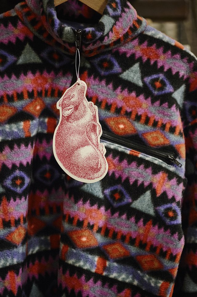
Maris: Printed Polar fleece. This is what brands are still doing now. You could throw this in a store today and it would be cool as ever.
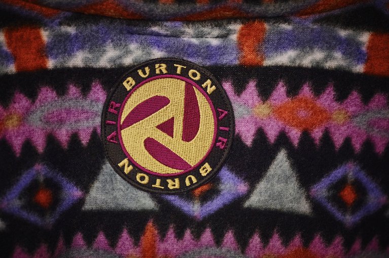
Dumont: I remember being young and loving that Burton re-appropriated the 45 rpm adapter and made it the air logo. It’s this thing that you put in a 45 record so you can make it play on a regular turn table. We were listening to a lot of music on 45 records. DJs were using these. So for Burton to appropriate that and make it theirs is cool.
Maris: This could have just died by the wayside, but these cool little hits make it what it is. This awesome rat tag, the old Burton Surfwear logo, this back hit with the air logo, this makes it timeless and classic. It’s all in the details.
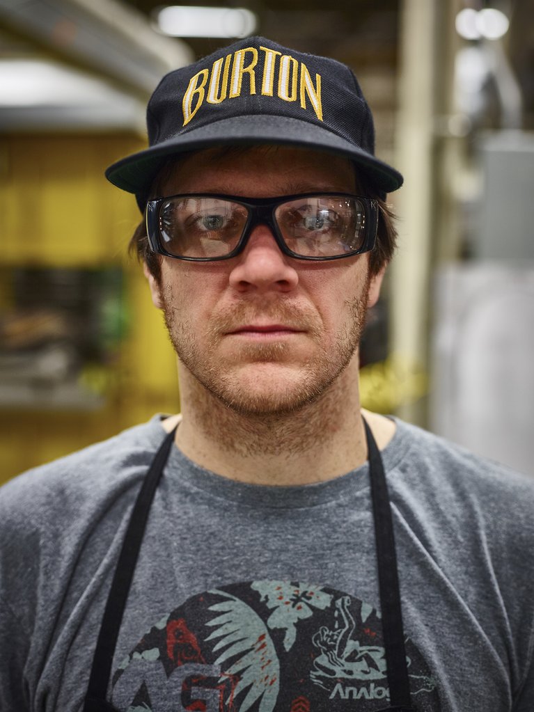
1993 Brewinz Cap
Maris: This is a timeless hat. It’s got a retro vibe now, but that’s great. That’s what’s popular. It’s such a timeless era. It’s weird when you’re creating, because you don’t think that someday it’s going to be this timeless thing. Drop this in the store today and you wouldn’t notice that it’s 20 years old. The materials haven’t moved on, the logo hasn’t moved on.
Dumont: Well, they say that people start to look back, culturally, and mimic the past during recessions because people don't feel like they want to take a stance and try something new when the economy is shit. You’ve seen that in the last few years. People are looking at the 1950s, early 60s, etc. But streetwear culture doesn’t reference the past, it’s taken on it’s own look and feel.
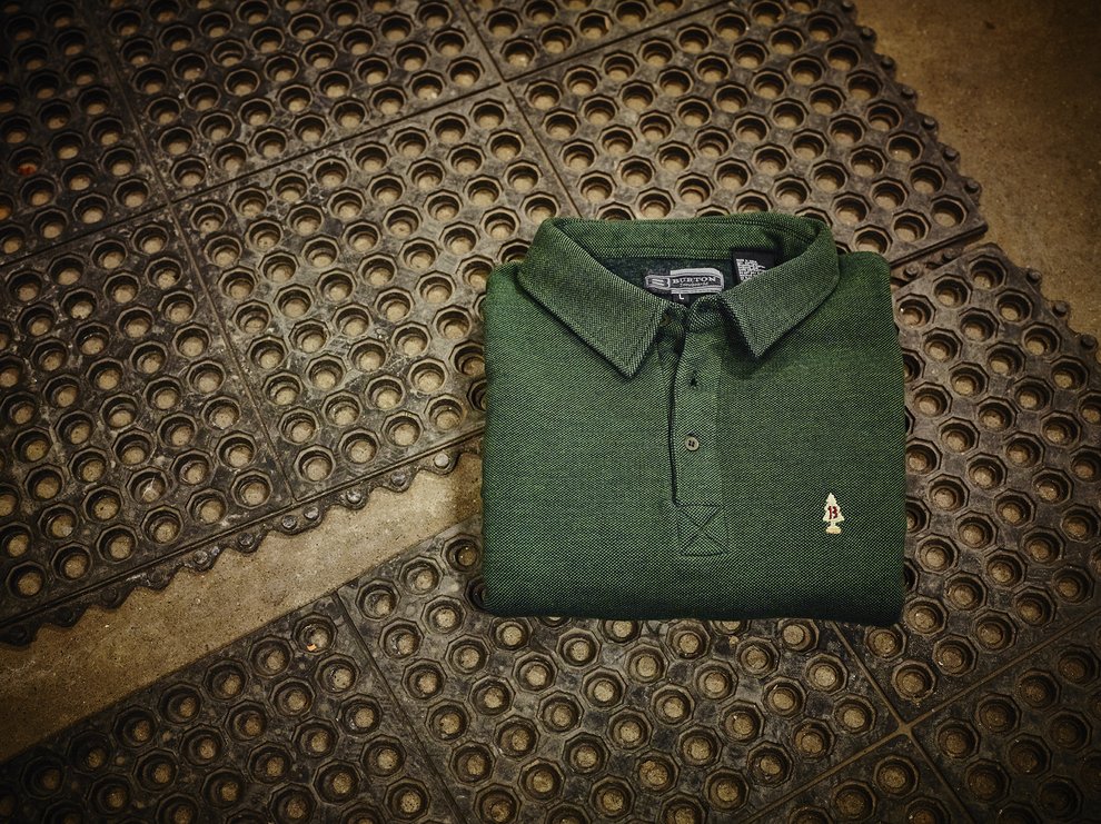
1995 Dad's Polka Shirt
Dumont: This was one of the first collared shirts we made. This is probably something that Jake was like, “Hey we should make something like this.” And it’s got the air freshener logo that the air freshener company sued us for. Oops…
We came, we saw, we got nerdy. As we move forward after looking through the past, one of Dumont’s observations rings true, “I always think of what it’s going to be like in 20 years when some kid is going through the archives and they find our shit. That’s gonna be cool. What will they think? Is that sick, or are we clowns?"
As we’ve learned here, only time will decide. ∆