Meet Burton’s 2026 Snowboards with Multiple Graphic Choices
Wait, Graphic...Options? Meet Burton’s 2026 Snowboards with Multiple Graphic Choices
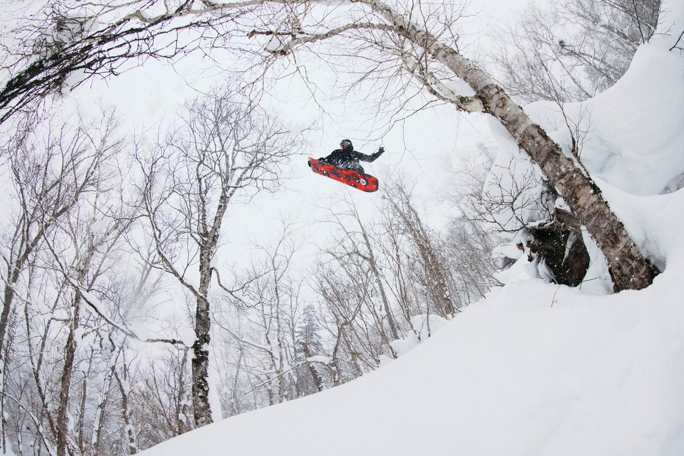
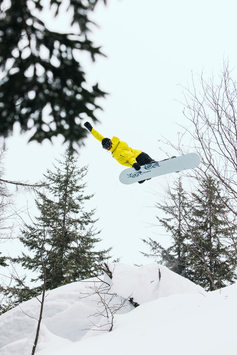
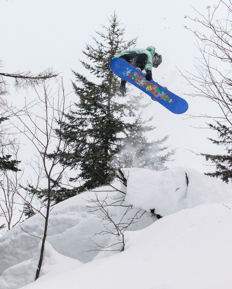
Red pill or blue pill? Regular or diet? Boxers or briefs? Graphic options are all about having choices, and for 2026 we’re serving up six different decks with multiple graphics to choose from. These aren’t just two-color variations of the same graphic, they’re full-on, different designs. Pick your poison, then carve, butter, bonk, or air with your own unique style.
Read on to learn how and why we created graphic options, who the artists bringing these snowboards to life are, and what we’ve got in the hopper for 2026 snowboard artwork.
Burton Snowboard Graphics: The Method to Our Madness
Every year the Burton design team undertakes the massive effort of creating new snowboard graphics, a process that is daunting but also incredibly fun and rewarding. Ultimately, it’s a team effort that relies on input from a wide swath of snowboarders and creatives.
Burton design lead Casey Callahan says it all begins with mood boards. “A mood board can be anything — a style we want to try like airbrush or graffiti, an artist we want to work with, somebody internal we think would create a good graphic, or photography.” From there, the team assembles a collection of roughly 100 images, which go out in survey form to Burton employees, Team riders, First Chair members, and others.
“In the past we relied on the survey quite heavily, and we still do,” Casey explains. “But now it’s more of a culture check for us… not just, oh, this image did amazing, let’s put it on a snowboard. Instead, we ask, why did it do amazing? Where are people’s heads at?”
Once the feedback comes in, the design team matches mood board directions to specific snowboard decks. The graphics must align with the intended use, like pairing cover art to an album; the feeling you get when you look at it has to match the sound within. After that, merchandizing briefs, artist availability, and mock-up feedback from riders and regional teams help narrow the field until the final graphics emerge.
Offering multiple graphics adds another layer of complexity, but it’s work that energizes the design team. Senior hardgoods category manager Lesley Betts frames the motivation: “For so long, we as board makers have essentially said, hey, this is what we think the one individual who would ride this board would like creatively. And that’s sort of a bummer because we know that people all want different things. What’s really cool about graphic options is we’re letting the rider make the decision of what’s right for them and not just making assumptions.”
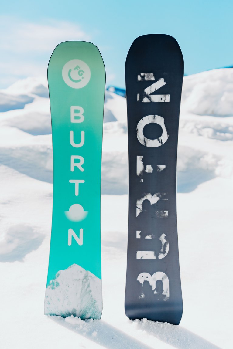
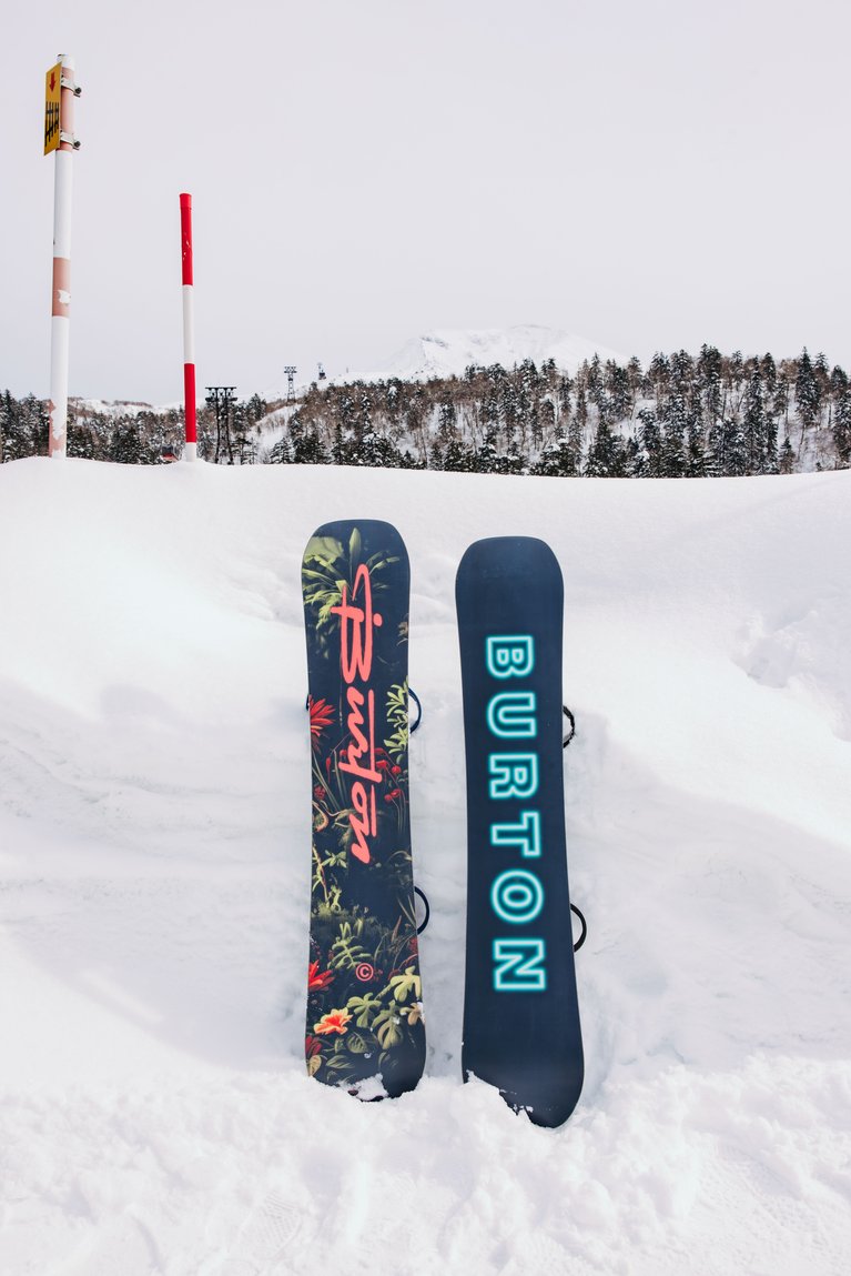
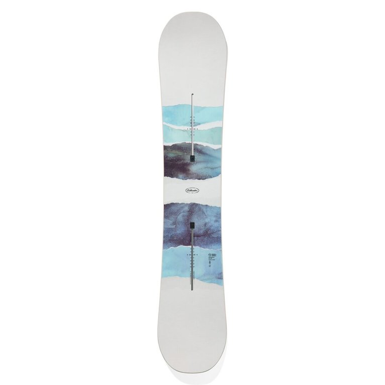
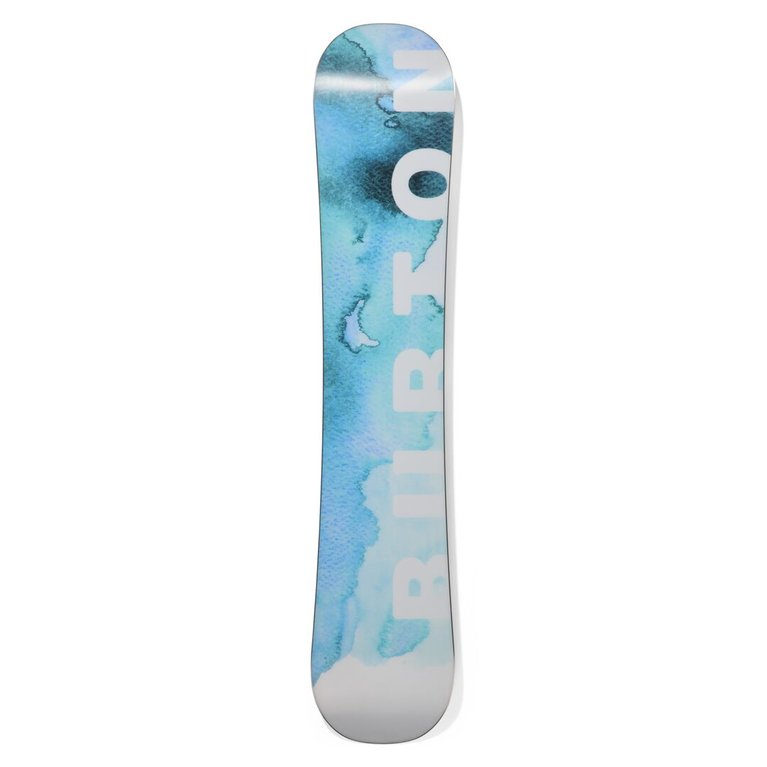
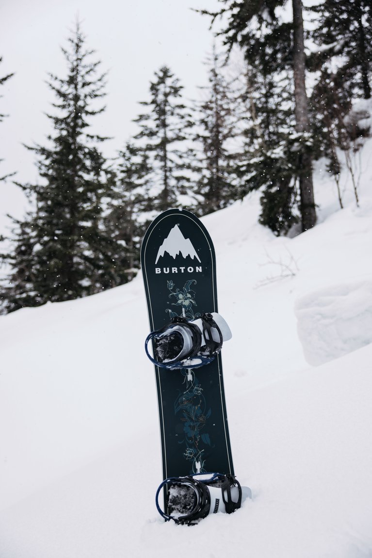
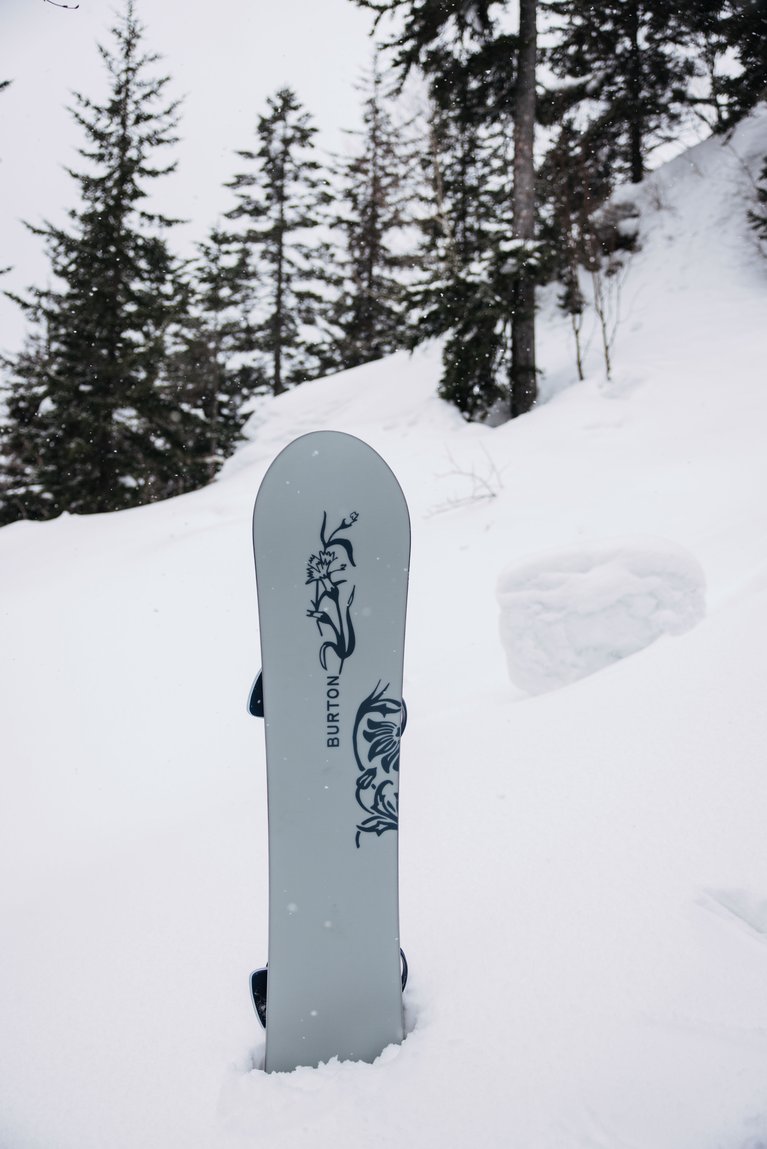
2026 Women’s Burton Feelgood Camber & Flying V
There was a time when many snowboard manufacturers (*nervously raises hand*) were simply shrinking men’s snowboard to “create” women’s models. But thankfully, there were strong voices like Shannon Dunn-Downing, who simply wouldn’t stand for bullshit shortcuts. Shannon knew that to properly design a women’s specific board, it had to happen from the ground up, and we took her advice. The result was the Feelgood, Burton’s first deck designed specifically for women. 2026 marks the 26th anniversary of the Feelgood, and there’s no better time to experience the legacy of this incredible all mountain snowboard, available in camber or flying v profiles, and now with multiple graphics. Because choices are better.
2026 Women’s Burton Feelgood Camber & Flying V Graphics
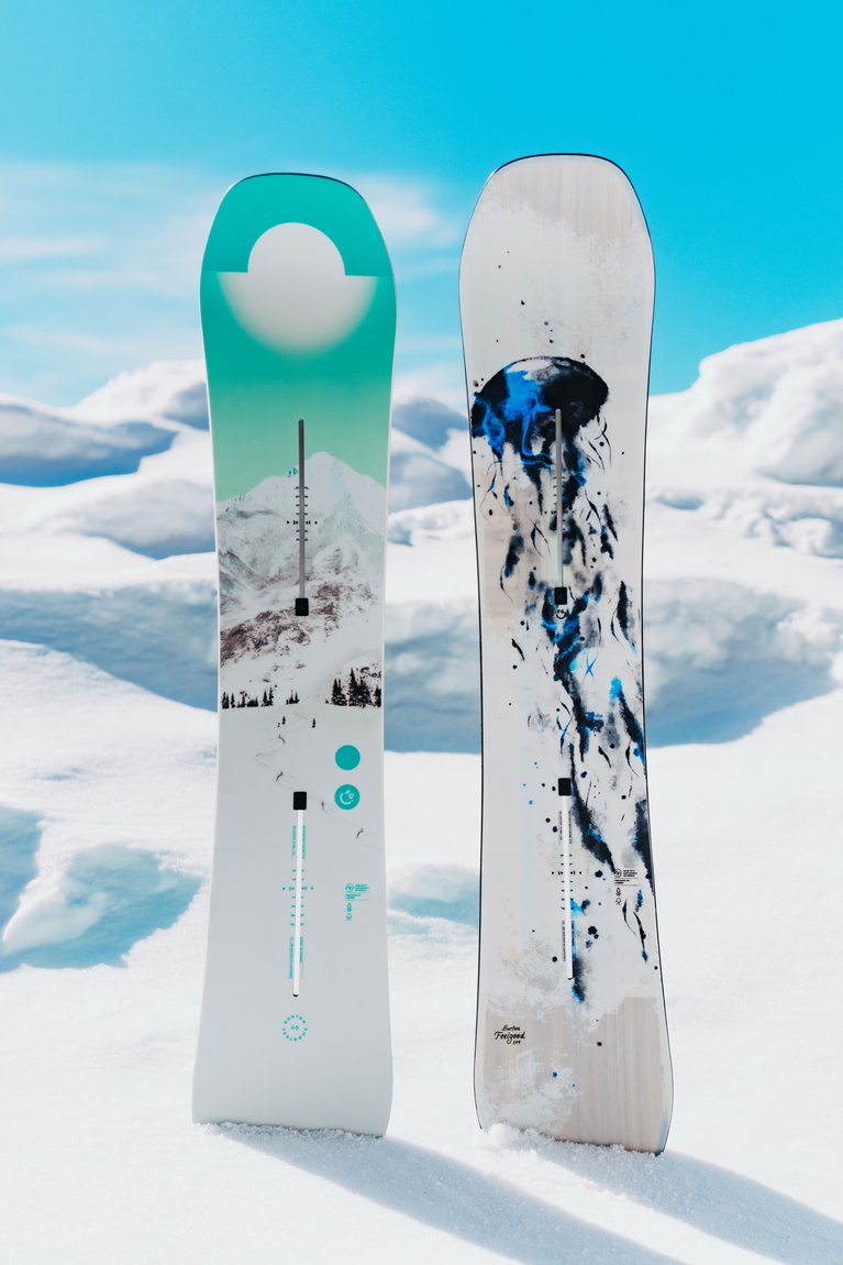
First Tracks: Chasing first tracks feels as good as it looks with the Burton Feelgood underfoot. Inspired by the energy and solitude of leaving your signature in the snow, this graphic captures the moment just like the Feelgood, so you can lay down your line with skill and grace.
Jellyfish: This season’s jellyfish graphic captures the flow of riding and the raw beauty of the terrain with a hint of the wood core, just like the board’s spirited ride lets you explore the terrain your way. Note that this graphic is only available on Feelgood Camber models.
Blank: Black and white is just right. If you love understated excellence, this simple colorway will keep you ripping all day. No flashy colors here, just a white top sheet and black base to keep you focused on the task at hand.
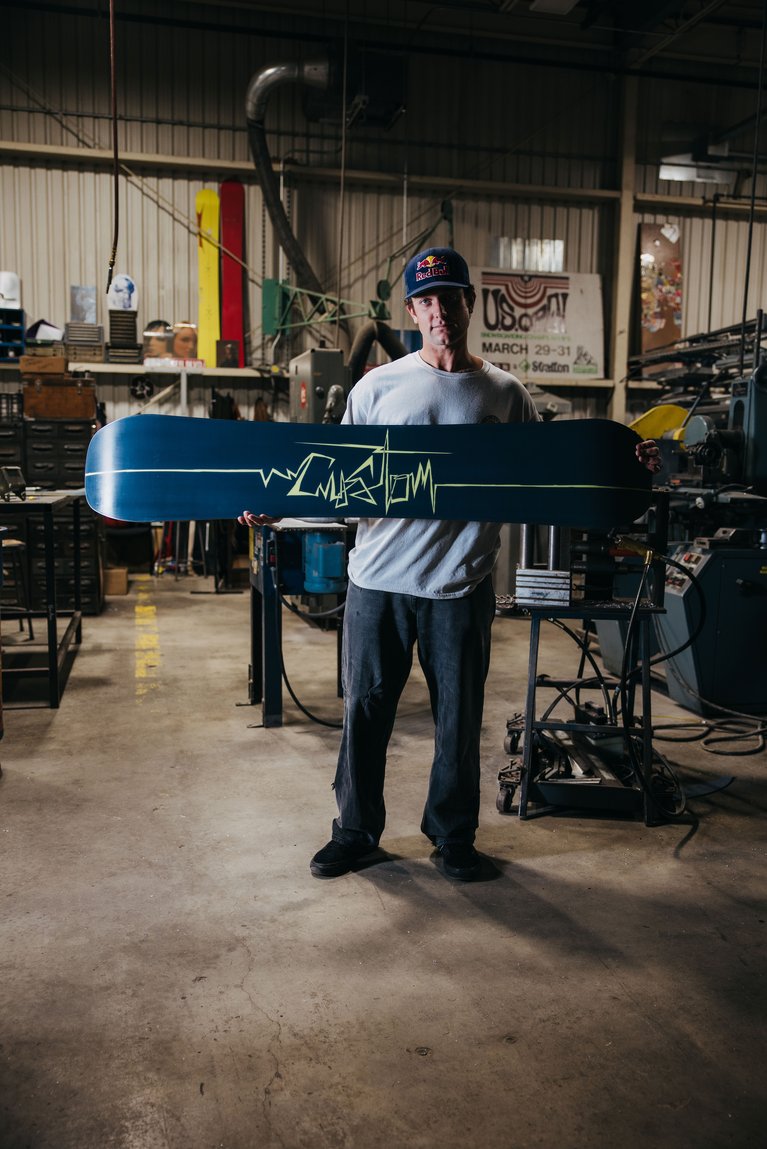
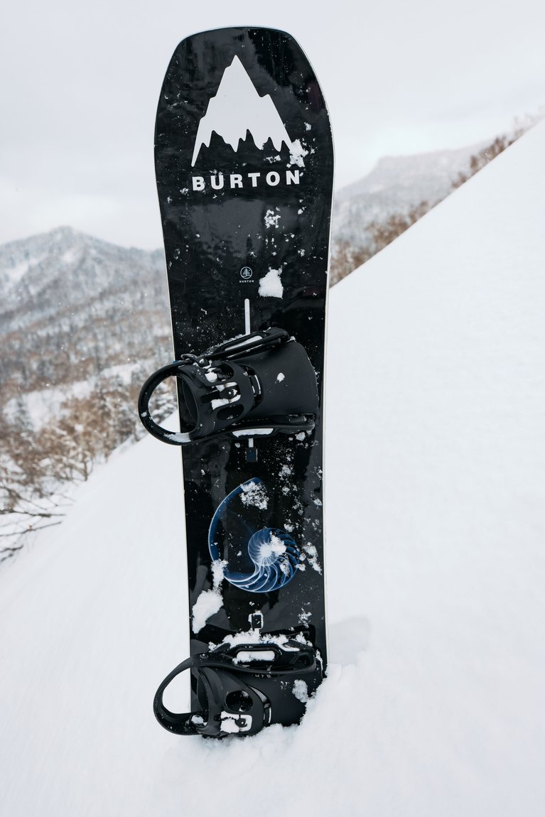
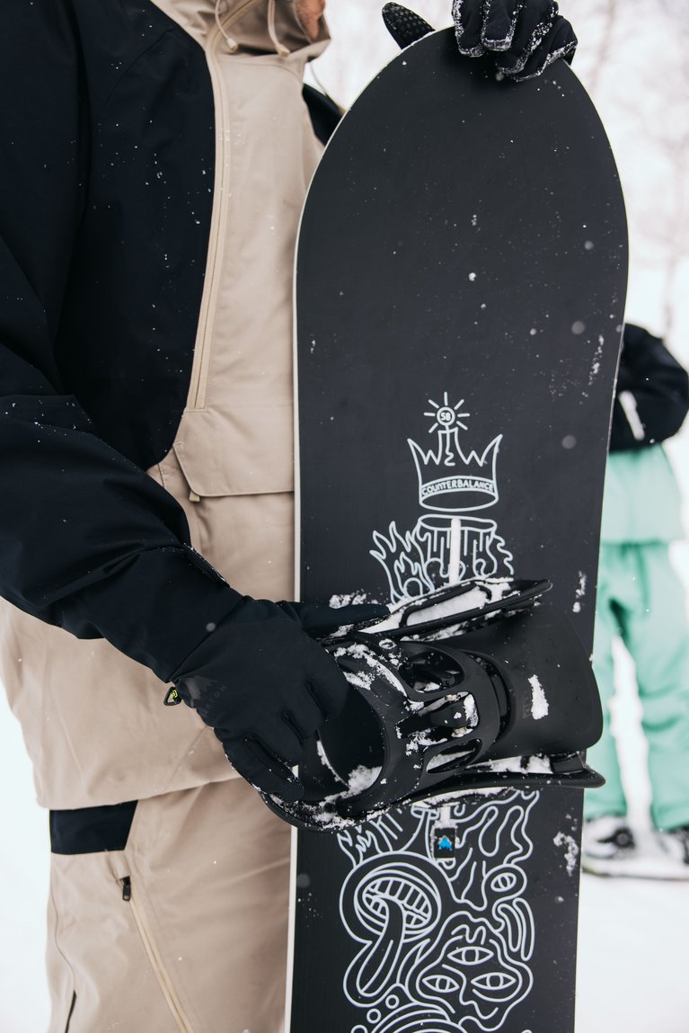
2026 Men’s Burton Custom Camber
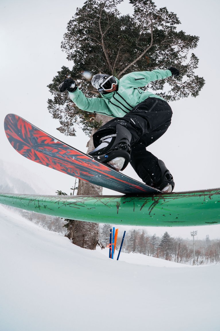
The stakes are always high when we’re talking about the all mountain perfection of the Burton Custom, the best-selling snowboard of all time. Maybe it’s the countless podiums it’s been hoisted above, or the consistency of its construction and performance. So how do you make the best better? Naturally, by offering four different graphics including Ben Ferguson’s Limited Edition 30th Anniversary Custom, jungle, a blank (black & white), and a glow-in-the-dark option - perfect for the cold-blooded among us, who love a good nighttime shred.
2026 Men’s Burton Custom Camber Graphics
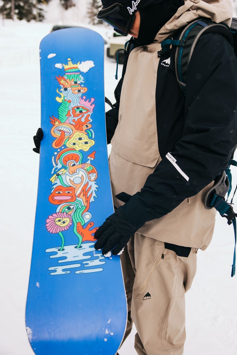
Jungle: Guided by its fast, fun, and versatile ride, the Custom with jungle graphics plays up a ride-to-paradise theme, sharing the board’s eclectic personality through the depth and color of the jungle landscape. This experimental, wild offering differs from anything we’ve done with Custom before, in terms of imagery.
Blank: Keeping it classy, the black and white, aka blank, is a simple, stripped-down, timeless colorway. This one’s a reminder that you don’t have to be flashy to absolutely rip.
Glow: Neon-inspired and ready to light up any terrain just like the poppy, precise ride of the Burton Custom. Glow-in-the-dark ink highlights the Channel and base lettering for extra pop to match the board’s agility. “[With Custom], we got to have a mild and a wild version. One that’s [more reminiscent of] what’s done well — if it ain’t broke don’t fix it — and then one where we’re dipping our toes [in the deep end].” Casey Callahan, Burton Design Lead.
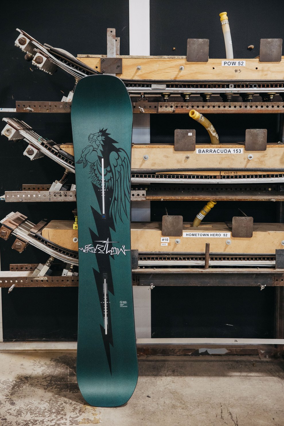
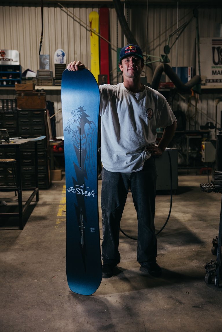
Ben Ferguson’s Limited Edition 30th Anniversary Custom: Burton team rider Ben Ferguson and the Burton Custom both turned 30 this year. To celebrate, we asked Ben to create some original artwork, a request he responded to with a throw-back inspired graphic of a Pegasus and lightning bolt. Like the winged horse that adorns this board, when you step on or strap into this classic, all mountain deck, be ready to spread your wings and fly.
“There was an era of custom graphics where it was super colorful...almost all the primary colors...and then there were the graphics where they're all flowy and lots of line work. And so I did some stuff like that and then, I don't know, I thought since it is the 30th anniversary, it should kind of hit a nod to the first [Custom] ever. And the first [Custom] did have the Pegasus on the top sheet and the base. So, I figured it'd be cool to draw Pegasus... and kind of making 'em a little trippy. Then I do love the lightning bolt – it has always been a cool symbol for me. I incorporated one of those, had a lot of fun doing it.”
- Burton Team rider Ben Ferguson, Ben’s Limited Edition 30th Anniversary Custom Artist.
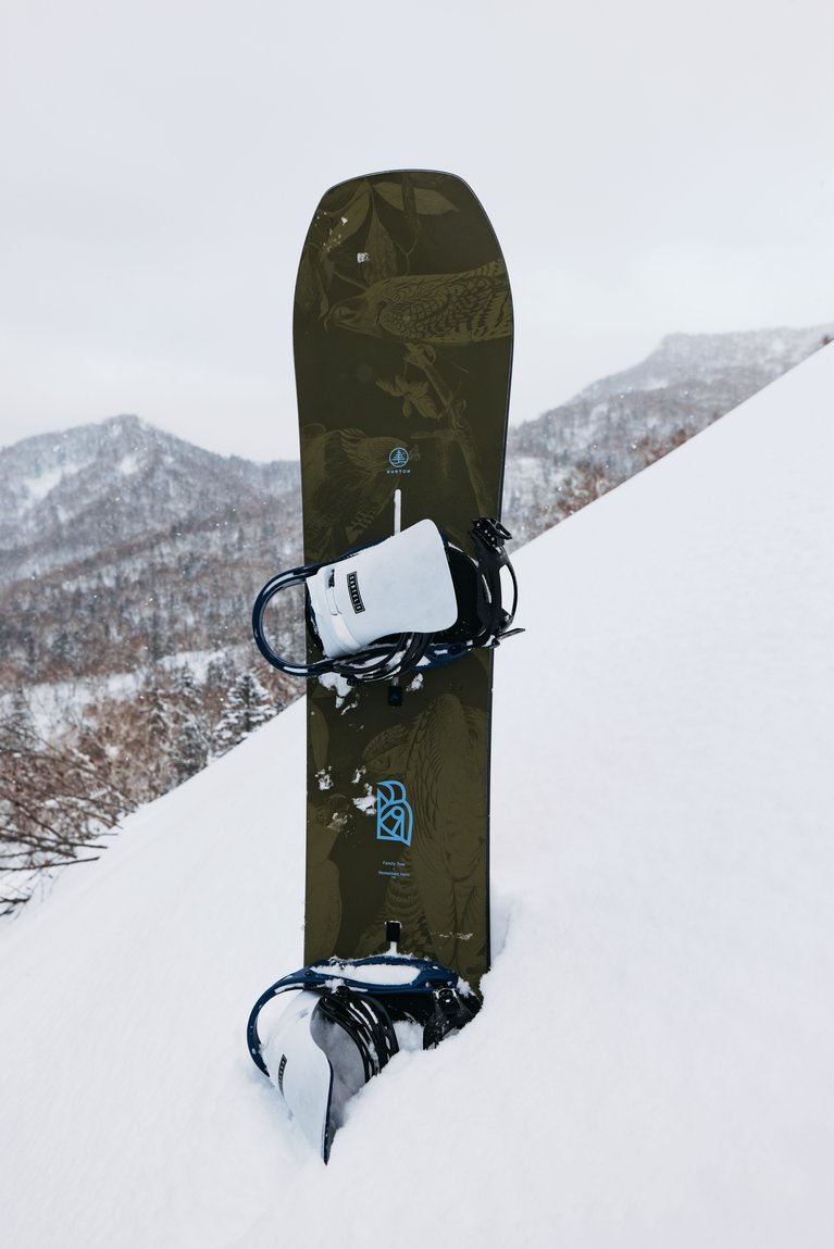
2026 Burton Family Tree Hometown Hero
You don't pound nails with a screwdriver; you need the right tool for the job. That’s the idea behind The Family Tree line of snowboards - purpose-built tools made with unique shapes for specific conditions and terrain. Within the Family Tree line of boards, the Hometown Hero has risen to a level of stardom that almost sets it aside on its own. It came from the mind of snowboard designer Scott Seward when we asked him to make the board of his dreams. The Hometown Hero was the result.
This beast of a board floats just as effortlessly as it turns on a dime. It excels in the deep thanks to a directional shape and some taper, but camber and ample pop allow the Hero to be a quiver-of-one when the day demands it.
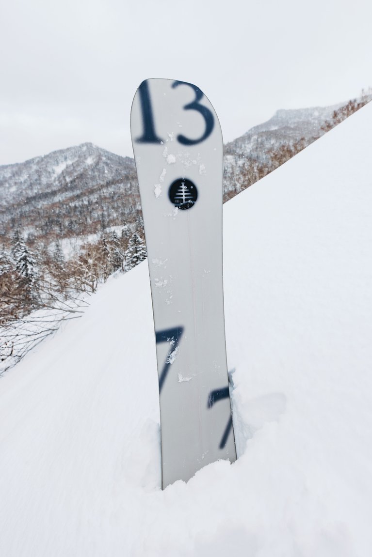
2026 Burton Family Tree Hometown Hero Graphics
Family Tree: Highlighting the board's iconic shape and ride, the Family Tree edition of the Hometown Hero features subtle but colorful Audubon eagle graphics symbolizing its powerful all-mountain personality.
X-ray: Bold and powerful yet refined, the X-ray strikes a balance just like the legendary performance of the HTH. The elegant black-and-white shell on the top sheet, and Burton-centric numbers on the base match the board’s balanced yet powerful quiver-of-one personality.
“The X-ray theme was so that you could feel like you could see inside your board and you could connect with it… There’s a really cool material finish on the top sheet where you can see the numbers 13 and 77 only under certain lighting. On the base there’s a 13 and 77 too, representing Family Tree and Burton history combined.”
-Casey Callahan, Burton Design Lead.
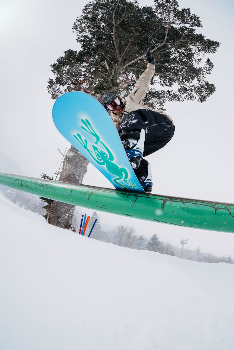
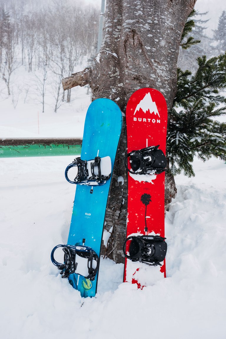
2026 Burton Blossom by Niels Schack
Multidisciplinary artist and Burton Team rider Niels Schack brought the Blossom into Burton’s bouquet of boards, and he returns for 2026 to shape the artwork once again on our flagship freestyle deck. He describes his design approach this way: “It usually starts with a strong narrative and a simple concept. I look around at the things I actually like and live with daily, and then curiosity drives the search. I play a kind of game with myself, trying to find the new subject or letting it find me. Once I bring it back to the team, we start digging into it heavily. In the past that has meant everything from sci-fi and physics, to rock formations, to Cartier jewelry. With Blossom, the word itself is so powerful that you can branch out in so many different directions.”
For 2026, he faced the added challenge of graphic optionality, creating two distinct graphics for the first time. Niels explains: “I wanted to create something like a Pokémon Red and Pokémon Blue contrast. The red one is inspired by chaos, punk, and youth, and it pulls directly from Raf Simons’s runway show Black Palms. The blue one is inspired by nature, breathing, and life. Together they form a kind of yin and yang.”
The Blossom still delivers on the ride side, with a proven twin shape, conventional camber, and a tech package that keeps freestyle riders pushing—Pro-Tip™, Infinite Ride™, Triax™ glass with carbon I-Beam™, and a sintered WFO base. In your hands, the Blossom is a volume knob you can crank up to 11, amplifying your freestyle ambitions.
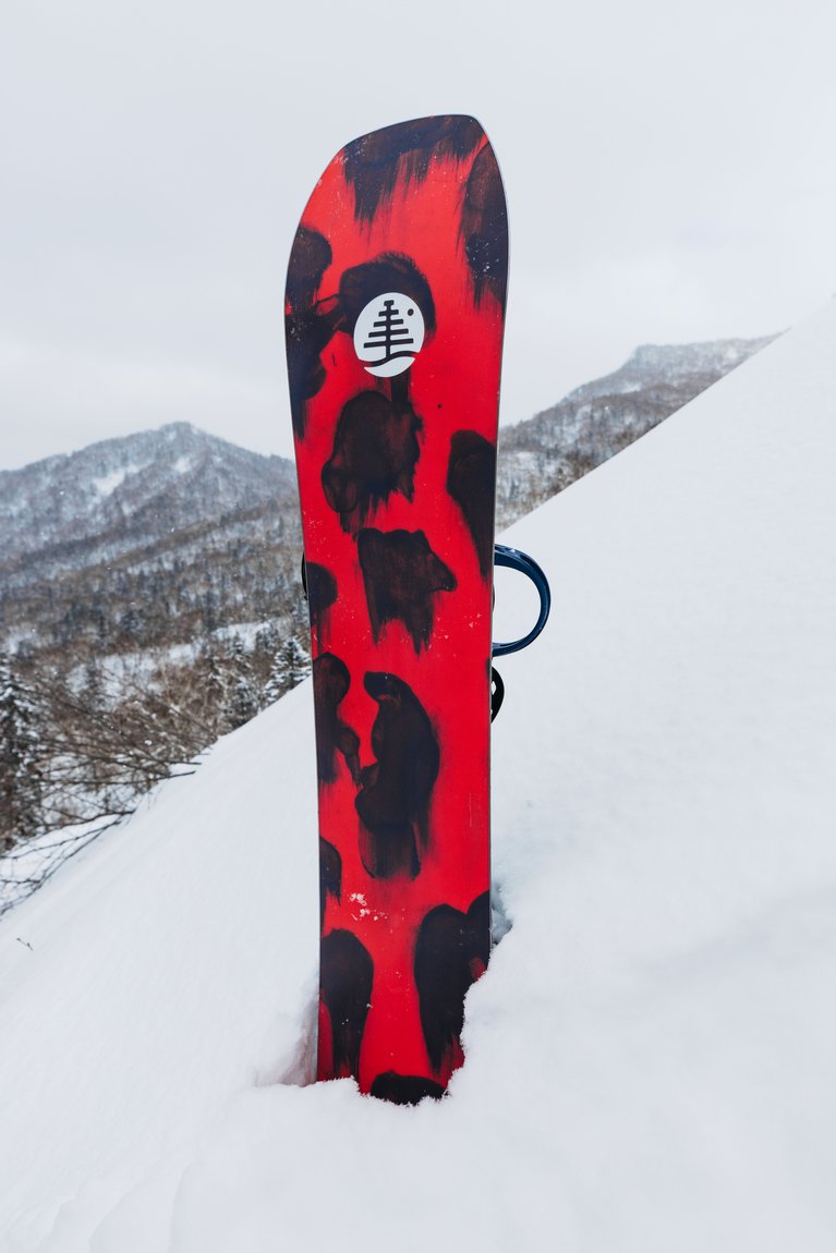
2026 Burton Blossom Graphics
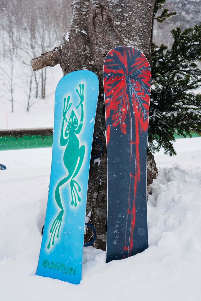
Frog: A playful frog stencil and bright lily pad scene evoke a lively, creative vibe that sums up the spirited true twin ride of the Blossom.
Cherry: A complementary graphic to the Frog, the Cherry, loaded with freestyle energy, features a fiery red deck and palm tree base.
“With a snowboard, the theme has to be really specific so everyone on the design side is aligned and understands the concept. With painting, it’s more free. It’s supposed to be more intimate and left open to interpretation. With a board, I want people to understand why it exists, not just see the artwork.”
-Niels Schack, Burton Team Rider & 2026 Blossom Artist.
2026 Burton Cultivator by Ali Leach & Karen Singh
The Cultivator is new in 2026, essentially replacing both the Ripcord and Stylus. The idea was simple; offer one gender-agnostic board that works for any rider who’s breaking into snowboarding. It had to be relatively affordable, easy to ride, and offer our progression-friendly tech, like a twin shape, easy-bevel base, and soft flex. And from the standpoint of design, Cultivator had to offer two unique graphic options across the full range of sizes. To achieve this final objective, we enlisted the help of artists Karan Singh (Chain link) and Ali Leach (Watercolor).
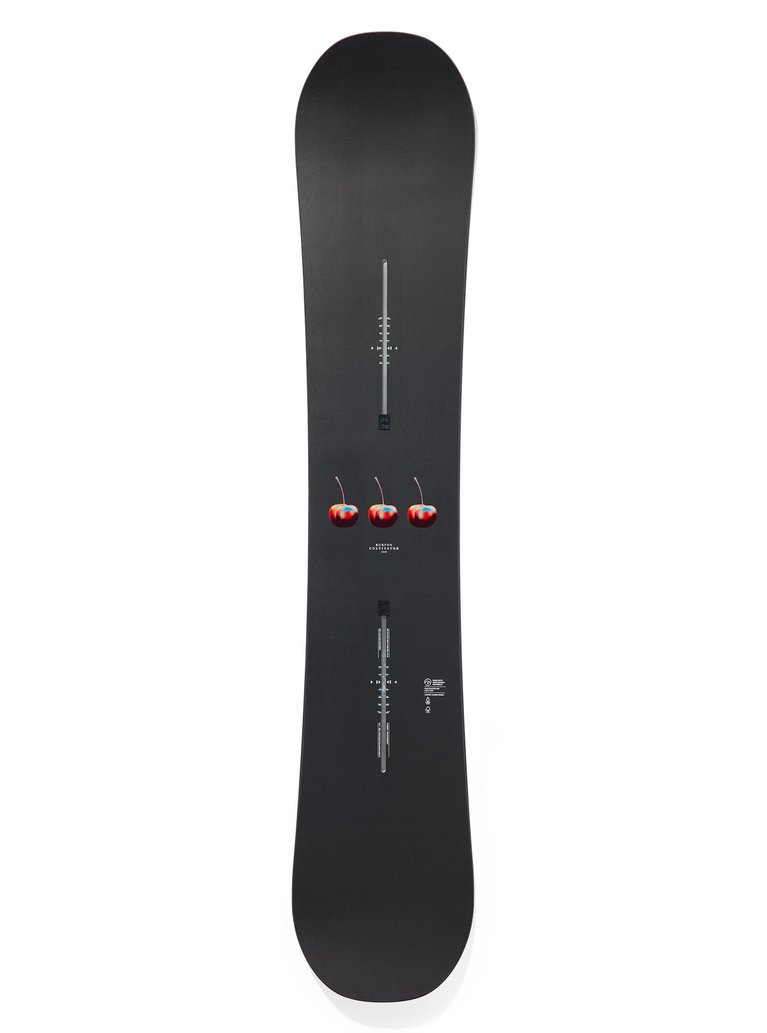
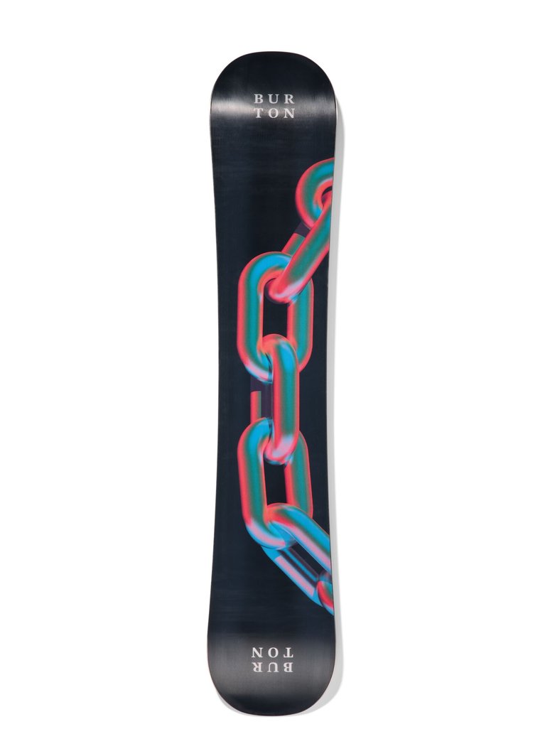
2026 Burton Cultivator Graphics
Watercolor: Inspired by the beauty of the winter landscape and layers of the learning curve, Burton product designer Ali Leach created the watercolor graphic that reflects it all on the Cultivator. Step up and cultivate your skills with a board that inspires progression and supports you every step of the way.
“I was inspired by the layers and depth of the green mountains and how they fade away into the distance, from dark to light. Watercolor is somewhat unpredictable, and I think it helped to bring a natural effect to the art, along with the hand torn edges, and purposeful layering. I probably made 100 pages of different abstract watercolors before tearing them up and deciding on the final composition. I played around with different methods such as pouring water, brushing paint, dabbing with paper towel, tilting the page of liquid, and even sprinkling salt and watching as it absorbed the moisture. I hope the peaceful nature of the process is translated into the final art. The biggest challenge was making sure the depth of the layered pages came through in the topsheet. Look closer and you will notice as it alternates from a matte to satin finish.”
-Ali Leach, 2026 Burton Cultivator “Watercolor” artist.
Chain Link: Riding progression is like a chain, with each skill building on the next. Artist Karan Signh brings ordinary shapes to life using color in new ways to reflect the Cultivator’s depth and strength for building your skills and taking on new terrain with confidence.
“The piece is originally called Union. I made it back in 2020, during a time when everyone was craving connection. The linked chain was my way of showing strength and unity in the middle of uncertainty. A lot of my process is about taking something ordinary and re-framing it so it feels new. In this case, it was a simple chain, but by pushing the color, light, and form it became a symbol of strength and connection. The relationship between the everyday and the extraordinary is something I love exploring in my work.”
-Karan Singh, 2026 Burton Cultivator “Chain Link” Artist.
2026 Burton Counterbalance by Dylan West & Sophie Sellstrom
Quiver killers like the new Burton Counterbalance exist to simplify your riding. Don’t look at the weather report, or waste time debating what terrain you’re going to explore. Just grab this board and go. The Counterbalance pairs a directional, all mountain shape with eight-millimeters of taper that was made to float, while still being comfortable for switch drop-ins. Premium construction, like Dualzone™ EGD™, carbon highlights, and a sintered WFO base pair perfectly with two graphic options from our incredibly talented Burton staff.
2026 Burton Counterbalance Graphics
Hallucinate: A weight that balances another weight, and the name of this new quiver killer deck (the Counterbalance). Burton graphic artist Dylan West created a psychedelic-inspired floral graphic to share his take on the board’s versatile personality. Clean and engaging on the top sheet. High energy and colorful on the base.
“We wanted a playful “floral” illustration running up the channels of the board that would show up black & white on the top sheet and in full color on the base. That was the ask for the actual content of the graphic but as for the actual style of the illustration, I usually just find myself drawing eyes, weird characters, and tongues whenever I doodle and that came across in this one. I do like to get off the computer for at least one step of the process when I’m designing something. Sometimes that’s creating the actual art by hand or playing with textures outside of photoshop and sometimes it’s just messing something up, then bringing it back into the computer. I’m a fan of imperfection in art and enjoy when I see something that has a hand done element to it.”
-Dylan West, 2026 Burton Counterbalance “Hallucinate” artist.
Deco: Burton visual merchandiser Sophie Sellstrom created an art deco-inspired floral graphic to share her take on the board’s versatile personality. Refined and intricate on the top sheet. Clean and elegant on the base.
“Board graphics have always been a reflection of what’s going on in the culture—sometimes rebellious, sometimes clean and minimal, sometimes weird and wild. I think the Counterbalance falls in that in-between space. It’s not loud, but it has presence. Kind of like a rider who’s calm, confident, and locked in. I wanted this board to feel like a blend of grace and grit—clean lines, but still with weight. Feminine without being soft.”
-Sophie Sellstrom, 2026 Counterbalance “Deco” Artist.