A Look Inside Burton’s New Brand Identity
There’s been a lot going on at Burton HQ over the past couple years, and part of it has been a deep dive, meditation, full juice cleanse on our branding. That includes our logo and a bunch of other stuff that makes Burton look like Burton.
The big headline is: We aren’t throwing away everything. Think of it as an evolution, not a revolution.
Maybe you’re wondering why you should care. And in reality, maybe you shouldn’t? It’s just a logo, anyway. But it is pretty cool when you look at the journey that got us here.
After all that soul searching, the logo we’ve landed on is actually just an evolution of two brand marks that Burton has used since way back when: the mountain, and the bar.
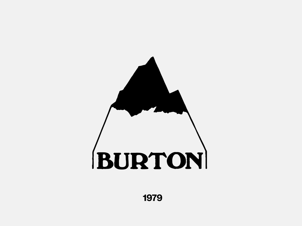
The mountain logo is one of the top 3 most iconic Burton images, right up there with the B (or is it a 13?) and that weird arrow thing we did back in the early 2000s. Everything started for Burton in the mountains, so it makes sense, right? The original mountain logo was the product of a design contest that our founder, Jake Burton Carpenter, held among his friends and family while starting the company back in the late 70s. It stuck around for quite some time.
So, why change it? Well, if you look closely, the OG mountain logo is a little clunky. It’s not geometrically balanced, and it has these two big fangs coming off the sides. This makes it hard to place on a lot of different things. So, we just cleaned it up. Now all the fangs are the same size, and when you put the mountain in the center of something it doesn’t look like it’s leaning off to one side.
Oh, and then there’s the bar logo. BURTON. Simple. Helvetica. Classic. This came out of the early 90s, a definitive era in terms of Burton’s cultural roots. We were experimenting with all things counter-culture. Everything was bold and provocative. The bar logo is featured on some of our most iconic products from the past, above the door at Burton HQ in Vermont, and everywhere in between all the way up to today. So, we took the best parts about it, massaged some of the rough edges, and will continue to use it alongside the mountain logo moving forward.
In that case, you might ask, why scrap any of our old logos? Well, as you can see, there are quite a few…
Pretty rad, right? All these other logos are still part of us. They’re like the tattoos down our arms, and the stickers on our boards. But we need one mark that people can recognize.
We’re all over the world, and are committed to leading snowboarding and the outdoor industry to a place where more people are participating around the globe. In order to show up the same for everyone, we have to pick one primary face of the brand and run with it. That way, when people see us, they recognize us. We can skip all the small talk and get right to the part where we’re best friends at 4am realizing we have to wake up in three hours to go snowboarding tomorrow and have the best day ever. Right?
So, there you go. New logo.